A floating action button (FAB) is used to signify the primary action to be taken on a particular screen. In this post, we’re going to learn how to use the button component (v-btn) to create FABs.
v-btn fab Prop
We can create an FAB by setting the fab prop of the button component to true:
<template>
  <v-app>
    <div class="text-center ma-4">
      <v-btn fab>
        <v-icon>mdi-plus</v-icon>
      </v-btn>
    </div>
  </v-app>
</template>

<script>
export default {
  name: 'App',
};
</script>

Vuetify FAB Color
We can use the color prop of the v-btn component to customize the color of the FAB.
<template>
  <v-app>
    <div class="text-center ma-4">
      <v-btn
        fab
        color="primary"
      >
        <v-icon>mdi-plus</v-icon>
      </v-btn>
    </div>
  </v-app>
</template>

<script>
export default {
  name: 'App',
};
</script>

Vuetify FAB Depressed
Setting the depressed prop of the v-btn component to true will remove elevation from an FAB.
<template>
  <v-app>
    <div class="text-center ma-4">
      <v-btn
        fab
        color="primary"
        depressed
      >
        <v-icon>mdi-plus</v-icon>
      </v-btn>
    </div>
  </v-app>
</template>

<script>
export default {
  name: 'App',
};
</script>

FAB icon Prop
The icon prop designates the button component as an icon. It removes the background and sets the FAB icon color to the value of the color prop.
<template>
  <v-app>
    <div class="text-center ma-4">
      <v-btn
        fab
        color="primary"
        icon
      >
        <v-icon>mdi-plus</v-icon>
      </v-btn>
    </div>
  </v-app>
</template>

<script>
export default {
  name: 'App',
};
</script>

Vuetify FAB Outlined
We can the outlined prop of the v-btn component to create an outlined FAB.
<template>
  <v-app>
    <div class="text-center ma-4">
      <v-btn
        fab
        color="primary"
        outlined
      >
        <v-icon>mdi-plus</v-icon>
      </v-btn>
    </div>
  </v-app>
</template>

<script>
export default {
  name: 'App',
};
</script>

Vuetify FAB Elevation
We can control the amount of elevation the FAB has with the elevation prop. We can set the elevation to a value between 0 and 24 inclusive.
<template>
  <v-app>
    <div class="text-center ma-4">
      <v-btn
        fab
        color="primary"
        elevation="10"
      >
        <v-icon>mdi-plus</v-icon>
      </v-btn>
    </div>
  </v-app>
</template>

<script>
export default {
  name: 'App',
};
</script>

Vuetify FAB Tile
The tile property removes the border-radius from the FAB:
<template>
  <v-app>
    <div class="text-center ma-4">
      <v-btn
        fab
        color="primary"
        tile
      >
        <v-icon>mdi-plus</v-icon>
      </v-btn>
    </div>
  </v-app>
</template>

<script>
export default {
  name: 'App',
};
</script>

Vuetify FAB Size
We can use one of the x-small, small, large, and x-large props to customize the size of the FAB.
<template>
  <v-app>
    <div class="d-flex justify-center">
      <div
        class="d-flex ma-4 align-center justify-space-around"
        style="width: 400px"
      >
        <v-btn
          fab
          color="primary"
          x-small
        >
          <v-icon>mdi-plus</v-icon>
        </v-btn>
        <v-btn
          fab
          color="primary"
          small
        >
          <v-icon>mdi-plus</v-icon>
        </v-btn>
        <v-btn
          fab
          color="primary"
        >
          <v-icon>mdi-plus</v-icon>
        </v-btn>
        <v-btn
          fab
          color="primary"
          large
        >
          <v-icon>mdi-plus</v-icon>
        </v-btn>
        <v-btn
          fab
          color="primary"
          x-large
        >
          <v-icon>mdi-plus</v-icon>
        </v-btn>
      </div>
    </div>
  </v-app>
</template>

<script>
export default {
  name: 'App',
};
</script>

Extended FAB
Vuetify doesn’t support it yet, but we can use custom CSS to create an extended FAB.
<template>
  <v-app>
    <div class="text-center ma-4">
      <v-btn
        fab
        color="primary"
        style="
          width: fit-content;
          border-radius: 100px;
          padding: 16px;
        "
      >
        <v-icon>mdi-plus</v-icon>
        Create
      </v-btn>
    </div>
  </v-app>
</template>

<script>
export default {
  name: 'App',
};
</script>

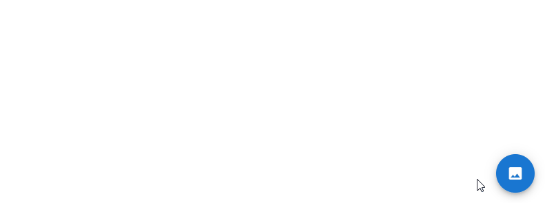
Vuetify FAB Speed Dial
With the speed dial component (v-speed-dial), an FAB can emit a stack of related actions when pressed:
<template>
  <v-app>
    <v-speed-dial
      v-model="fab"
      direction="top"
      transition="slide-y-reverse-transition"
      absolute
      bottom
      right
    >
      <template v-slot:activator>
        <v-btn
          v-model="fab"
          color="blue darken-2"
          dark
          fab
        >
          <v-icon v-if="fab"> mdi-close </v-icon>
          <v-icon v-else> mdi-image </v-icon>
        </v-btn>
      </template>
      <v-btn
        fab
        small
      >
        <v-icon>mdi-pencil</v-icon>
      </v-btn>
      <v-btn
        fab
        small
      >
        <v-icon>mdi-plus</v-icon>
      </v-btn>
      <v-btn
        fab
        small
      >
        <v-icon>mdi-star</v-icon>
      </v-btn>
    </v-speed-dial>
  </v-app>
</template>

<script>
export default {
  name: 'App',
  data: () => ({
    fab: false,
  }),
};
</script>
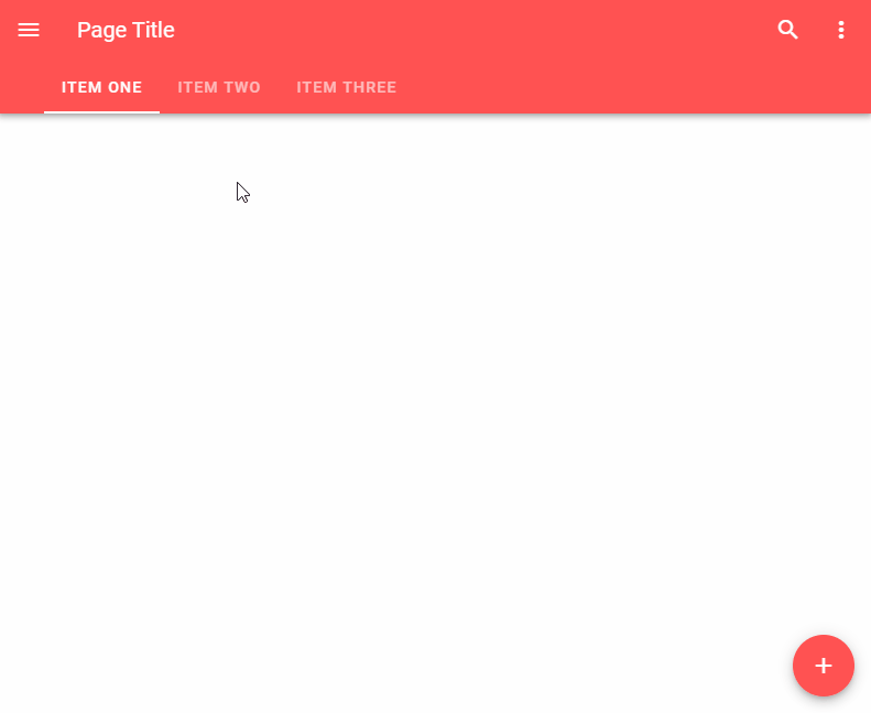
Using FABs in Lateral Screens
There are certain instances where we have FABs with different actions on screens next to each other, like the content screens of a set of tab items. We can display a transition to signify the change of action with the fab-transition component. fab-transition works with the key prop of the v-btn. It triggers the transition when the FAB key changes.
<template>
  <v-app>
    <v-app-bar
      dark
      color="red accent-2"
      app
    >
      <v-app-bar-nav-icon></v-app-bar-nav-icon>
      <v-toolbar-title>Page Title</v-toolbar-title>
      <v-spacer></v-spacer>
      <v-btn icon>
        <v-icon>mdi-magnify</v-icon>
      </v-btn>
      <v-btn icon>
        <v-icon>mdi-dots-vertical</v-icon>
      </v-btn>
      <template v-slot:extension>
        <v-tabs
          v-model="tabs"
          align-with-title
        >
          <v-tab href="#one"> Item One </v-tab>
          <v-tab href="#two"> Item Two </v-tab>
          <v-tab href="#three"> Item Three </v-tab>
          <v-tabs-slider color="white"></v-tabs-slider>
        </v-tabs>
      </template>
    </v-app-bar>
    <v-main>
      <v-fab-transition>
        <v-btn
          :key="activeFab.icon"
          fab
          right
          absolute
          bottom
          style="bottom: 16px"
          color="red accent-2"
          dark
        >
          <v-icon>{{ activeFab.icon }}</v-icon>
        </v-btn>
      </v-fab-transition>
    </v-main>
  </v-app>
</template>

<script>
export default {
  name: 'App',
  data: () => ({
    fab: false,
    hidden: false,
    tabs: null,
  }),

  computed: {
    activeFab() {
      switch (this.tabs) {
        case 'one':
          return {
            icon: 'mdi-plus',
          };
        case 'two':
          return { icon: 'mdi-pencil' };
        case 'three':
          return {
            icon: 'mdi-play',
          };
        default:
          return {};
      }
    },
  },
};
</script>
Conclusion
A floating action button (FAB) is used to indicate the main action to be performed on a screen. We can use the fab prop of the v-btn component in combination with various other props to create and customize FABs.
Every Crazy Thing JavaScript Does
A captivating guide to the subtle caveats and lesser-known parts of JavaScript.
