
A carousel is useful for displaying many images in a cyclic view. It comes with functionality that allows users to view the images one after the other. It allows multiple pieces of related visual content to occupy the same screen space. In this article, we’re to learn how to create and customize carousels using Vuetify.
The v-carousel component
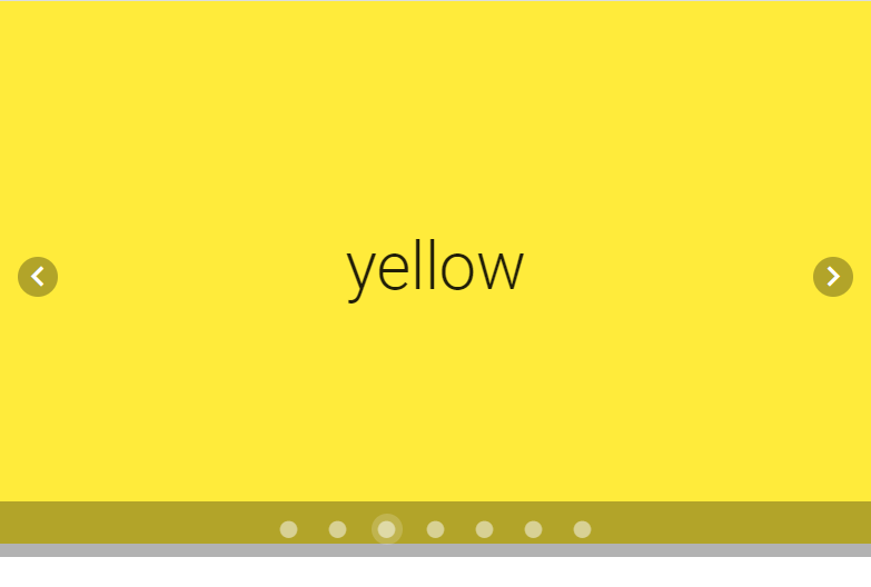
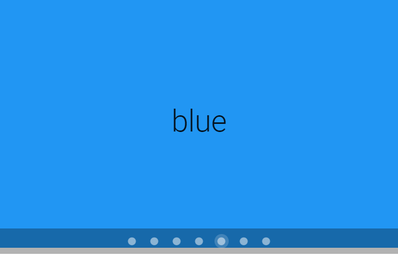
Vuetify provides the v-carousel component for creating carousels. We can create a slide in the carousel by adding a new v-carousel-item component to the v-carousel. Here we’re creating 7 slides, each for a color of the rainbow.
<template>
  <v-app>
    <v-carousel>
      <v-carousel-item v-for="color in colors" :key="color">
        <v-sheet :color="color" height="100%" tile>
          <v-row class="fill-height" align="center" justify="center">
            <div class="text-h2">
              {{ color }}
            </div>
          </v-row>
        </v-sheet>
      </v-carousel-item>
    </v-carousel>
  </v-app>
</template>
<script>
export default {
  name: 'App',
  data: () => ({
    colors: ['red', 'orange', 'yellow', 'green', 'blue', 'indigo', '#7f00ff'],
  }),
};
</script>
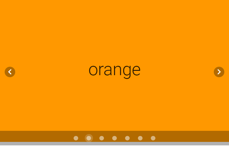
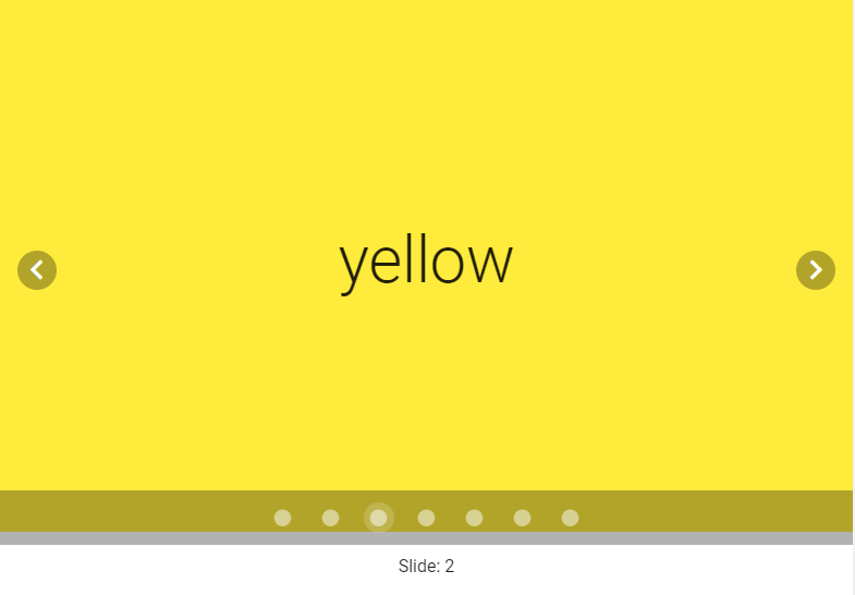
The carousel will always show the first slide by default:
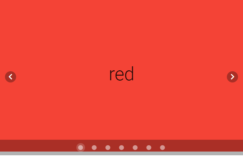
We can change the current slide with the displayed arrows. The left arrow will show the previous slide, while the right arrow will show the next slide:
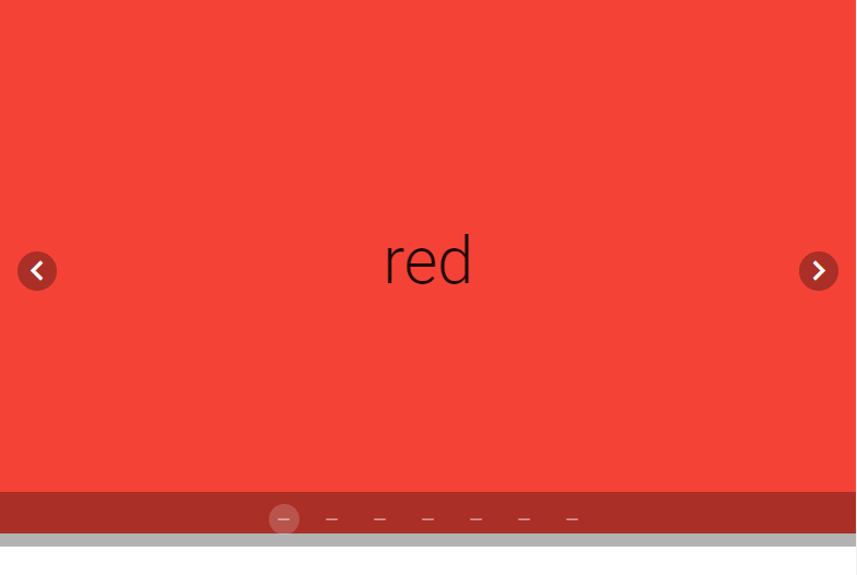
Carousel delimiter icons
The carousel comes with delimiters that indicate the number of slides the carousel has and the one it is currently showing. v-carousel comes with the delimiter-icon prop which allows us to customize the delimiter icons with any of the available icons.
<template>
  <v-app>
    <v-carousel delimiter-icon="mdi-minus">
      <v-carousel-item v-for="color in colors" :key="color">
        <v-sheet :color="color" height="100%" tile>
          <v-row class="fill-height" align="center" justify="center">
            <div class="text-h2">
              {{ color }}
            </div>
          </v-row>
        </v-sheet>
      </v-carousel-item>
    </v-carousel>
  </v-app>
</template>
<script>
export default {
  name: 'App',
  data: () => ({
    colors: ['red', 'orange', 'yellow', 'green', 'blue', 'indigo', '#7f00ff'],
  }),
};
</script>
Custom carousel transitions
Use the transition prop to customize the transition the carousel uses to display the next image.
<template>
  <v-app>
    <v-carousel>
      <v-carousel-item
        v-for="color in colors"
        :key="color"
        transition="fade-transition"
      >
        <v-sheet :color="color" height="100%" tile>
          <v-row class="fill-height" align="center" justify="center">
            <div class="text-h2">
              {{ color }}
            </div>
          </v-row>
        </v-sheet>
      </v-carousel-item>
    </v-carousel>
  </v-app>
</template>
<script>
export default {
  name: 'App',
  data: () => ({
    colors: ['red', 'orange', 'yellow', 'green', 'blue', 'indigo', '#7f00ff'],
  }),
};
</script>
You can also change the transition the carousel uses to display the previous image, with the reverse-transition prop:
<template>
  <v-app>
    <v-carousel>
      <v-carousel-item
        v-for="color in colors"
        :key="color"
        transition="fade-transition"
        reverse-transition="fade-transition"
      >
        <v-sheet :color="color" height="100%" tile>
          <v-row class="fill-height" align="center" justify="center">
            <div class="text-h2">
              {{ color }}
            </div>
          </v-row>
        </v-sheet>
      </v-carousel-item>
    </v-carousel>
  </v-app>
</template>
<script>
export default {
  name: 'App',
  data: () => ({
    colors: ['red', 'orange', 'yellow', 'green', 'blue', 'indigo', '#7f00ff'],
  }),
};
</script>
Automatic carousel transitions
Cycle
Setting the cycle prop to true on a v-carousel will make it automatically transition to the next slide after a set amount of time.
<template>
  <v-app>
    <v-carousel cycle>
      <v-carousel-item
        v-for="color in colors"
        :key="color"
      >
        <v-sheet :color="color" height="100%" tile>
          <v-row class="fill-height" align="center" justify="center">
            <div class="text-h2">
              {{ color }}
            </div>
          </v-row>
        </v-sheet>
      </v-carousel-item>
    </v-carousel>
  </v-app>
</template>
<script>
export default {
  name: 'App',
  data: () => ({
    colors: ['red', 'orange', 'yellow', 'green', 'blue', 'indigo', '#7f00ff'],
  }),
};
</script>
Interval
By default, the carousel shows each slide for an interval of 6 seconds before automatically transitioning to the next slide when the cycle prop is set to true. We can modify this interval with the interval prop.
<template>
  <v-app>
    <v-carousel cycle interval="1000">
      <v-carousel-item v-for="color in colors" :key="color">
        <v-sheet :color="color" height="100%" tile>
          <v-row class="fill-height" align="center" justify="center">
            <div class="text-h2">
              {{ color }}
            </div>
          </v-row>
        </v-sheet>
      </v-carousel-item>
    </v-carousel>
  </v-app>
</template>
<script>
export default {
  name: 'App',
  data: () => ({
    colors: ['red', 'orange', 'yellow', 'green', 'blue', 'indigo', '#7f00ff'],
  }),
};
</script>
Hiding navigation controls
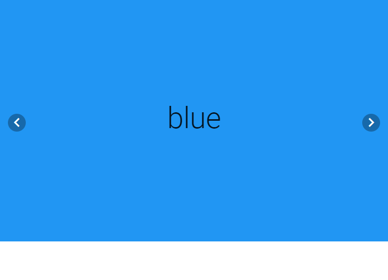
We can hide the navigation controls of the carousel by setting the show-arrows prop to false:
<template>
  <v-app>
    <v-carousel :show-arrows="false">
      <v-carousel-item v-for="color in colors" :key="color">
        <v-sheet :color="color" height="100%" tile>
          <v-row class="fill-height" align="center" justify="center">
            <div class="text-h2">
              {{ color }}
            </div>
          </v-row>
        </v-sheet>
      </v-carousel-item>
    </v-carousel>
  </v-app>
</template>
<script>
export default {
  name: 'App',
  data: () => ({
    colors: ['red', 'orange', 'yellow', 'green', 'blue', 'indigo', '#7f00ff'],
  }),
};
</script>
We might want to have the carousel only display its navigation controls when the mouse hovers over it. We can do this by setting the show-arrows-on-hover prop to true:
<template>
  <v-app>
    <v-carousel :show-arrows-on-hover="true">
      <v-carousel-item v-for="color in colors" :key="color">
        <v-sheet :color="color" height="100%" tile>
          <v-row class="fill-height" align="center" justify="center">
            <div class="text-h2">
              {{ color }}
            </div>
          </v-row>
        </v-sheet>
      </v-carousel-item>
    </v-carousel>
  </v-app>
</template>
<script>
export default {
  name: 'App',
  data: () => ({
    colors: ['red', 'orange', 'yellow', 'green', 'blue', 'indigo', '#7f00ff'],
  }),
};
</script>
Now it’s only when you hover over the carousel with the mouse that you see its controls:
Customized arrows
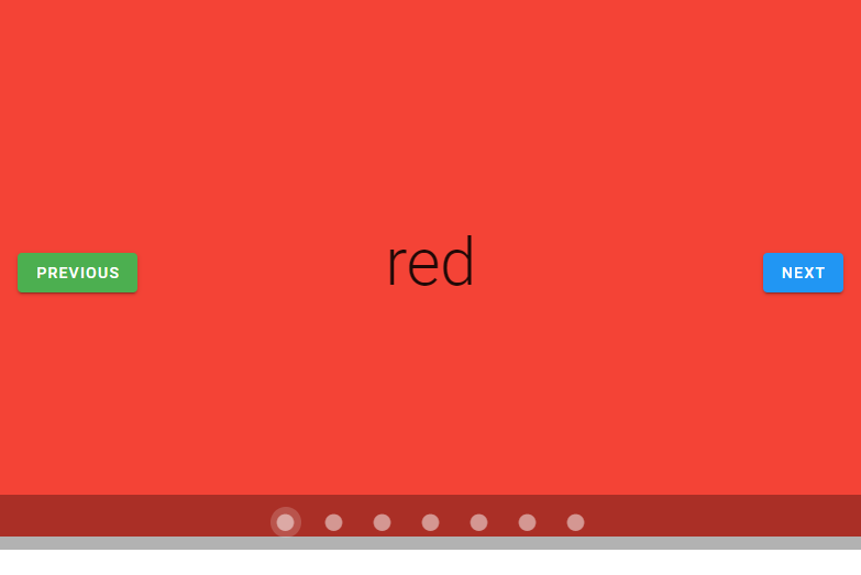
We can customize the carousel arrows with the prev and next slots.
<template>
  <v-app>
    <v-carousel>
      <template v-slot:prev="{ on, attrs }">
        <v-btn color="green" v-bind="attrs" v-on="on"> Previous </v-btn>
      </template>
      <template v-slot:next="{ on, attrs }">
        <v-btn color="blue" v-bind="attrs" v-on="on">Next</v-btn>
      </template>
      <v-carousel-item v-for="color in colors" :key="color">
        <v-sheet :color="color" height="100%" tile>
          <v-row class="fill-height" align="center" justify="center">
            <div class="text-h2">
              {{ color }}
            </div>
          </v-row>
        </v-sheet>
      </v-carousel-item>
    </v-carousel>
  </v-app>
</template>
<script>
export default {
  name: 'App',
  data: () => ({

    colors: ['red', 'orange', 'yellow', 'green', 'blue', 'indigo', '#7f00ff'],
  }),
};
</script>
Hiding carousel delimiters
Setting the hide-delimiters prop to true will hide the bottom controls of the carousel.
<template>
  <v-app>
    <v-carousel hide-delimiters>
      <v-carousel-item v-for="color in colors" :key="color">
        <v-sheet :color="color" height="100%" tile>
          <v-row class="fill-height" align="center" justify="center">
            <div class="text-h2">
              {{ color }}
            </div>
          </v-row>
        </v-sheet>
      </v-carousel-item>
    </v-carousel>
  </v-app>
</template>
<script>
export default {
  name: 'App',
  data: () => ({
    colors: ['red', 'orange', 'yellow', 'green', 'blue', 'indigo', '#7f00ff'],
  }),
};
</script>
Two-way binding with v-model
We can use v-model on the v-carousel to set up a two-way binding between the current carousel slide and a variable. In the code below, we create a carousel and some text below it that displays the index of the current slide with the carousel variable:
<template>
  <v-app
    <v-carousel v-model="carousel">
      <v-carousel-item v-for="color in colors" :key="color">
        <v-sheet :color="color" height="100%" tile>
          <v-row class="fill-height" align="center" justify="center">
            <div class="text-h2">
              {{ color }}
            </div>
          </v-row>
        </v-sheet>
      </v-carousel-item>
    </v-carousel>
    <div class="d-flex justify-center mt-2">Slide: {{ carousel }}</div>
  </v-app>
</template>
<script>
export default {
  name: 'App',
  data: () => ({
    carousel: 0,
    colors: ['red', 'orange', 'yellow', 'green', 'blue', 'indigo', '#7f00ff'],
  }),
};
</script>
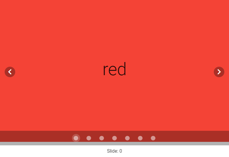
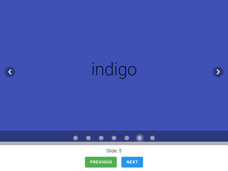
Changing the displayed carousel slide updates carousel, which updates the text:
Now let’s add two buttons below the text to change the displayed carousel slide:
<template>
  <v-app>
    <v-carousel v-model="carousel">
      <v-carousel-item v-for="color in colors" :key="color">
        <v-sheet :color="color" height="100%" tile>
          <v-row class="fill-height" align="center" justify="center">
            <div class="text-h2">
              {{ color }}
            </div>
          </v-row>
        </v-sheet>
      </v-carousel-item>
    </v-carousel>
    <div class="d-flex justify-center mt-2">Slide: {{ carousel }}</div>
    <div class="d-flex justify-center mt-2">
      <v-btn class="mr-2" color="green" dark @click="carousel--"
        >Previous</v-btn
      >
      <v-btn class="ml-2" color="blue" dark @click="carousel++">Next</v-btn>
    </div>
  </v-app>
</template>
<script>
export default {
  name: 'App',
  data: () => ({
    carousel: 0,
    colors: ['red', 'orange', 'yellow', 'green', 'blue', 'indigo', '#7f00ff'],
  }),
};
</script>
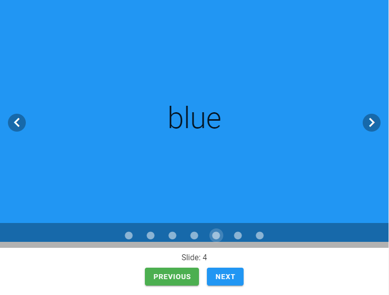
The “Previous” button decrements carousel which takes the carousel to the previous slide, while the “Next” button increments carousel to transition the carousel to the next slide:
Conclusion
We use a carousel in a user interface to display a number of related visual content in the same screen space. Use the v-carousel and v-carousel-item components to create a carousel and customize its behavior and appearance.
Every Crazy Thing JavaScript Does
A captivating guide to the subtle caveats and lesser-known parts of JavaScript.

Hey man, I am not normally a web developer, since I do industrial automation, but like every developer from time to time, I have to get out of my comfort zone, and I have to say, in those times, your work is absolutely helpful and great!
Thank you for your appreciation!