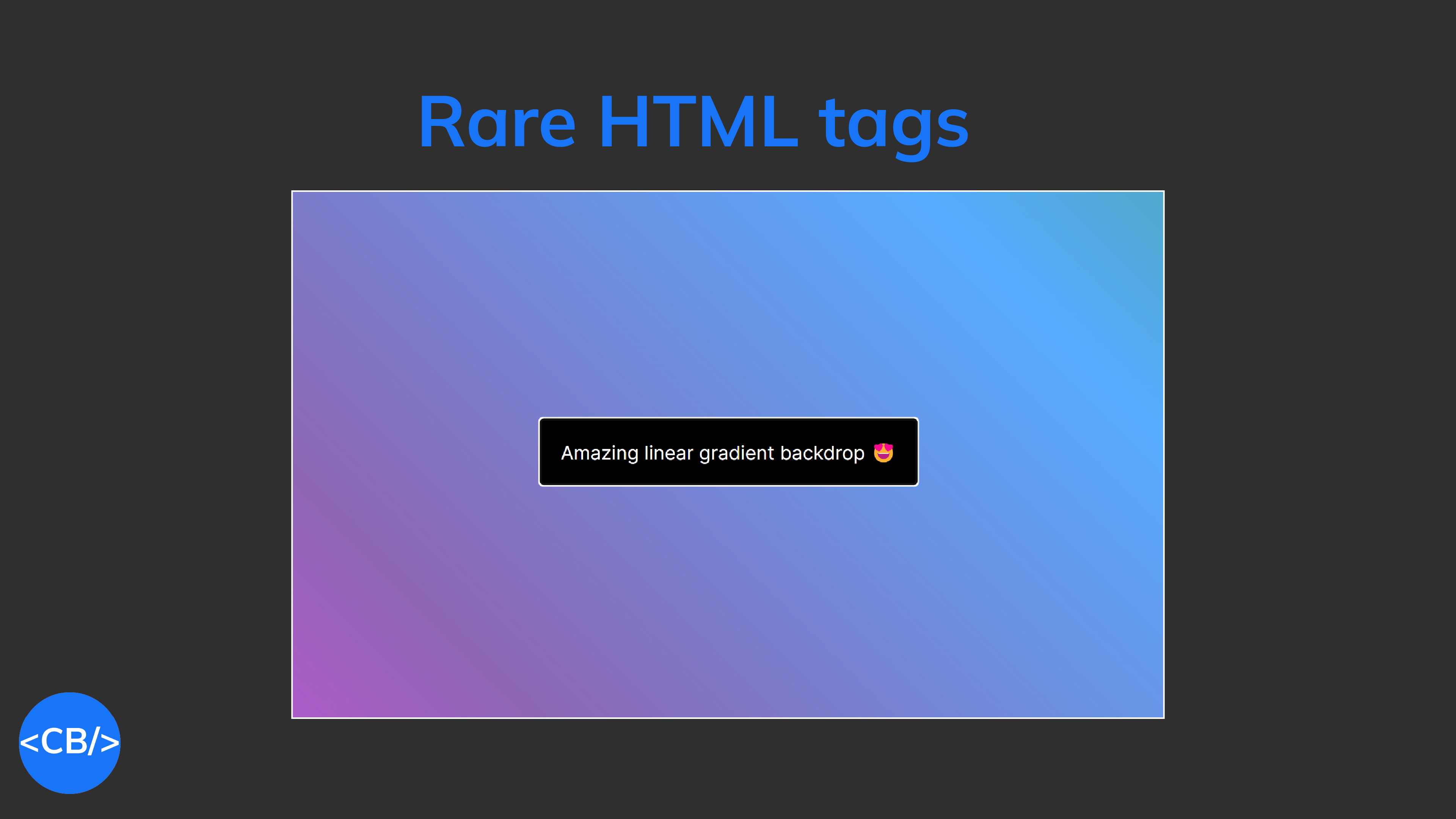
Nobody wants to use these HTML tags 😭
Trust me, you can do MUCH better than <div> <a> and <p>.
Living images, built-in dialogs, a href hacking…
There’s a whole lot of sophisticated tags to discover.
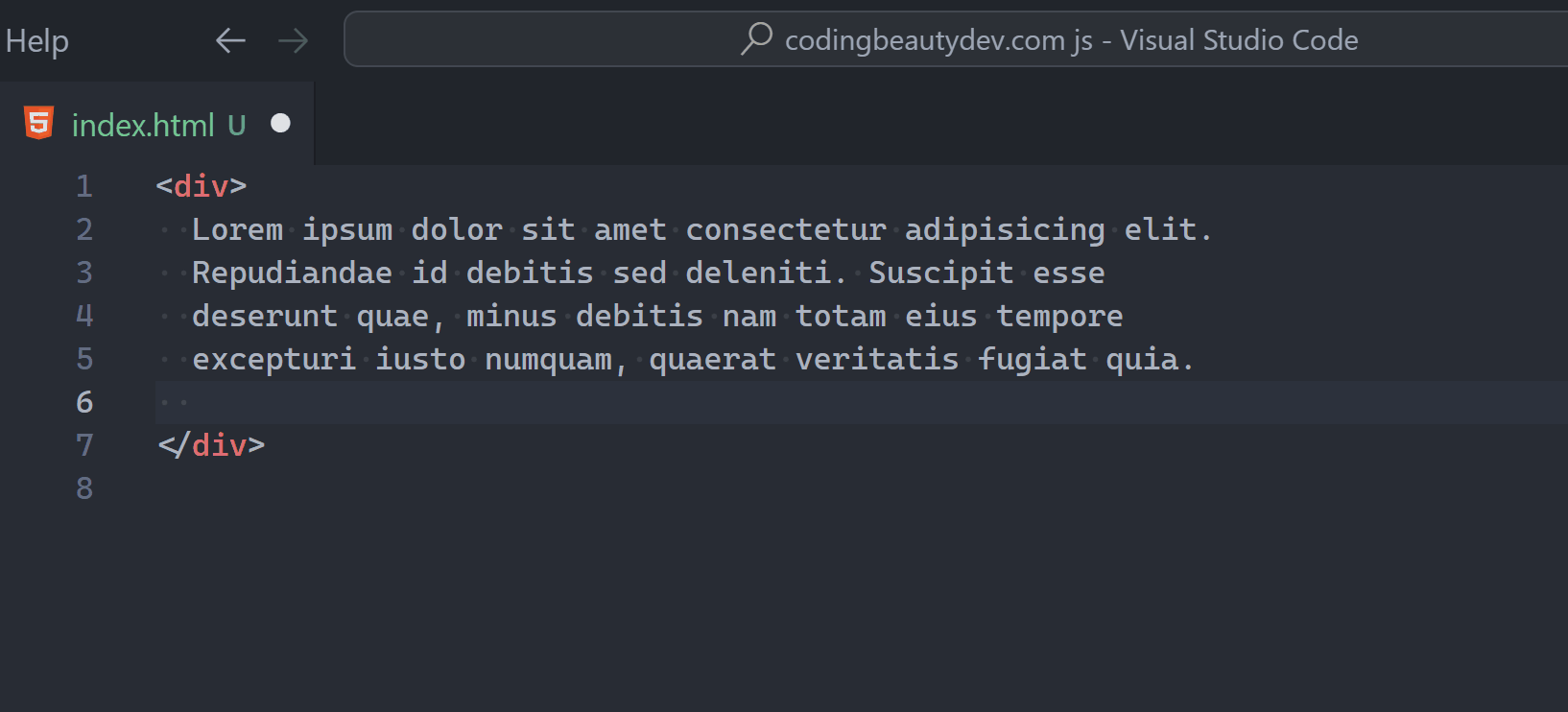
1. progress and meter
So first there’s progress – your typical drama-free progress bar.
You set a value and max for gradation — pretty straightforward.
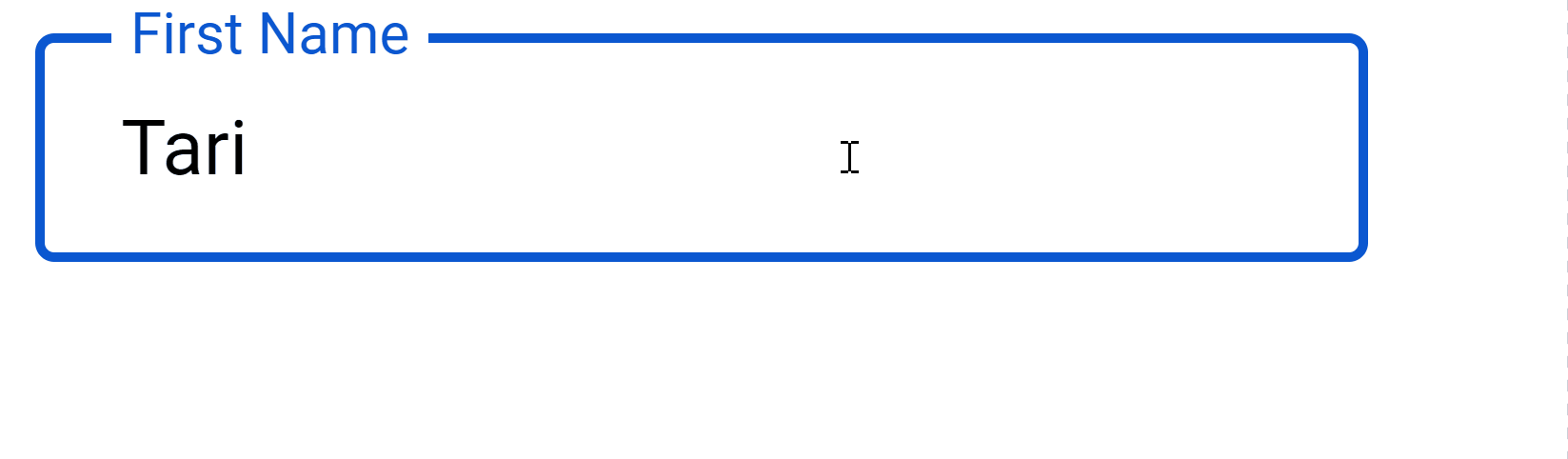
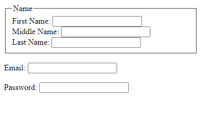
<label for="file"
  >Downloading knowledge into evil AI</label
>
<progress id="file" value="0" max="100">32%</progress>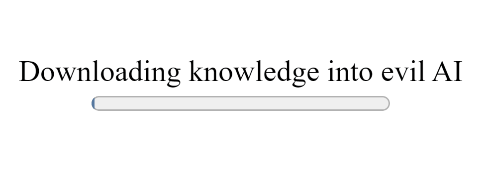
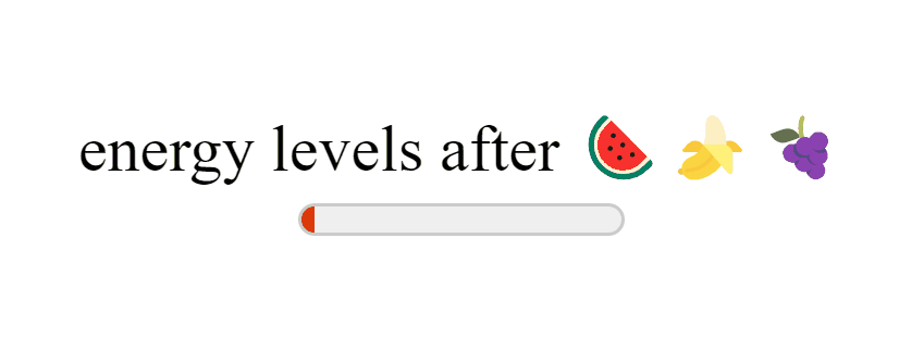
But then there’s meter — also known as progress on a rampage:
<label for="energy">energy levels after 🍉🍌🍇</label>

<meter
  id="energy"
  min="0"
  max="100"
  low="25"
  high="75"
  optimum="80"
  value="50"
/>
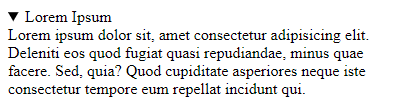
2. dfn
dfn — for anything we’re gonna define in the page:
<div>
  <dfn>Mellifluous</dfn> sounds are smooth, musical🎶,
  and pleasant to hear
</div>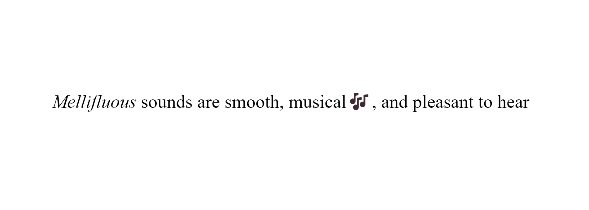
And the definition must be inside the dfn‘s parent tag, or else…
Or else nothing — just a semantic rule you can happily disregard.
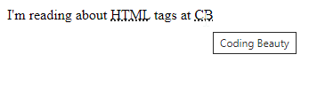
3. dialog
New native HTML dialogs!
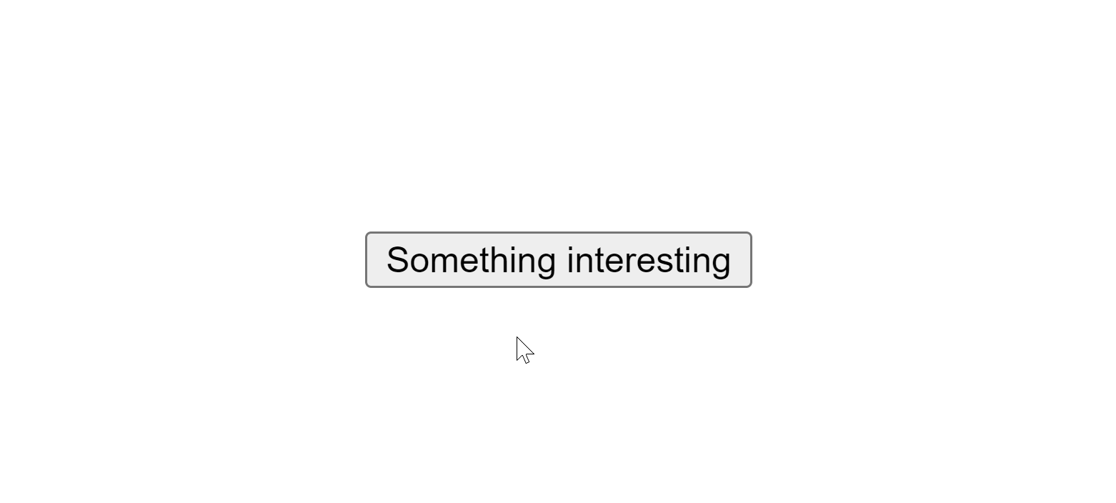
<dialog id="dialog">
  ⚡Lighting strikes the earth 44 times every second!
</dialog>

<button>Something interesting</button>const dialog = document.getElementById('dialog');
const button = document.querySelector('button');
button.addEventListener('click', () => {
dialog.showModal();
});
Stay open from the get-go:
<!-- btw setting open to "false" won't do anything -->
<dialog id="dialog" open>
  😻 Cats have over 30 different muscles just in their
  ears, allowing them to swivel them in all directions.
</dialog>
Built-in support for closing:
<dialog id="dialog" open>
  Your free trial is over! Subscribe for as low as $5
  billion per month
  <form method="dialog">
    <button>Get lost</button>
  </form>
</dialog>
And powerful, flexible customization letting you create wonderful UIs like this:
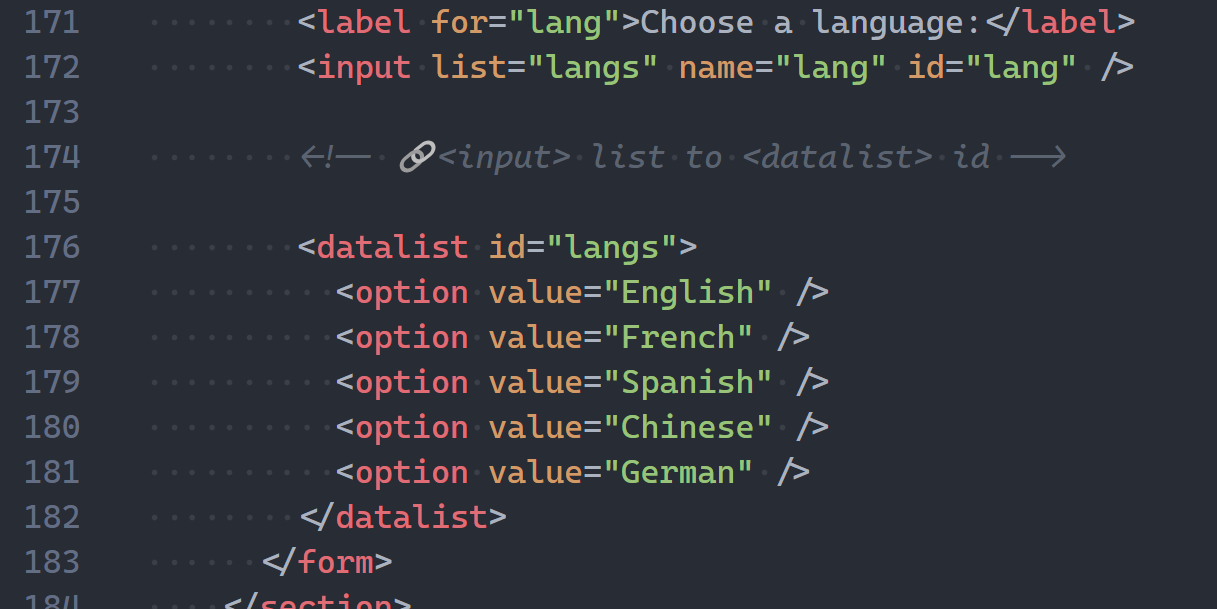
4. map and area
<map> and <area> — powerful combo to create clickable areas in images:
<img
  src="workplace.jpg"
  alt="Workplace"
  usemap="#workmap"
  width="400"
  height="379"
/>
<map name="workmap">
  <area
    shape="rect"
    coords="34,44,270,350"
    alt="Computer"
    href="computer.html"
  />
  <area
    shape="rect"
    coords="290,172,333,250"
    alt="Phone"
    href="phone.html"
  />
  <area
    shape="circle"
    coords="337,300,44"
    alt="Cup of coffee"
    href="coffee.html"
  />
</map>
We call clickable images like these image maps.
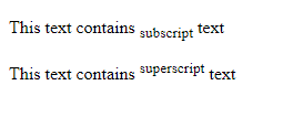
5. bdo
Super cryptic acronym here, what does it do?
This 👇
<!-- dir = direction -->
<!-- rtl = right-to-left -->
<bdo dir="rtl">
  🥺🥰but when I saw you I felt something I never felt...
</bdo>
That’s why it stands for: bi-directional override.
6. base
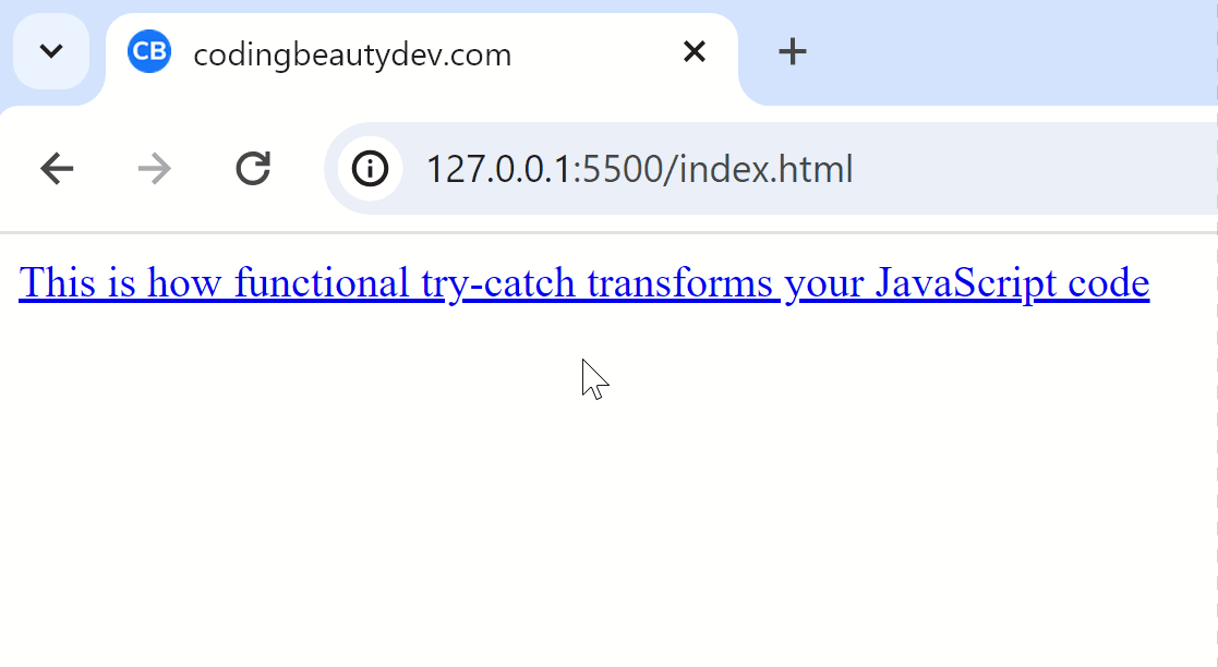
So you know how relative URLs normally work right? 👇
<body>
  <a href="/blog/javascript-functional-try-catch"
    >This is how functional try-catch transforms your
    JavaScript code
  </a>
</body>
The <a>‘s use the page’s domain to get the full URL they’ll navigate you to:
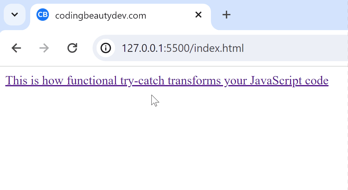
But what happens when you create a foundational <base> in the HTML?
<head>
  <!-- ✅ <base> tag -->
  <base href="https://www.codingbeautydev.com" />
  <title>codingbeautydev.com</title>
</head>

<body>
  <a href="/blog/javascript-functional-try-catch"
    >This is how functional try-catch transforms your
    JavaScript code
  </a>
</body>
Now they all use the hardcoded value in the <base>‘s href to get the full URL:
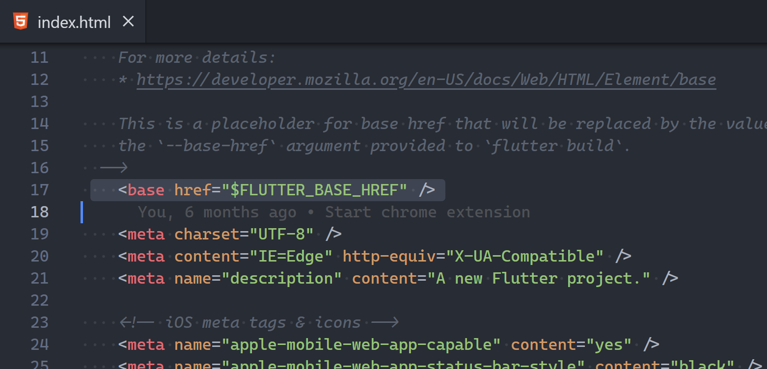
Frameworks like Angular and Flutter Web use it too:
7. time
For dates and times:
My Journal
<br/><br/>
<time>2:36pm</time> -- I asked her if she wanted to
grab a cup of coffee with me
<br />
<time>3:50pm</time> -- Still dealing with the brutal
rejection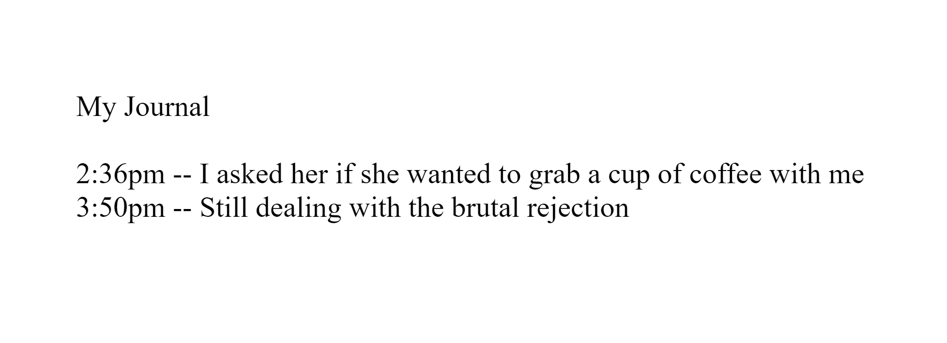
No fancy visuals but it means a lot to search engines.
With time they better understand the dates in your page and produce smarter results.
Especially with the datetime attribute:
<time datetime="2025-01-07">AI singularity</time> is
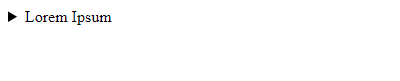
coming sooner than you think!8. hgroup
<hgroup> is all about family.
It tells the entire world that a heading tag and some content below are related:
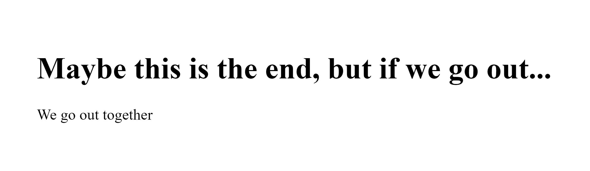
<hgroup>
  <h1>Maybe this is the end, but if we go out...</h1>
  <p>We go out together</p>
</hgroup>
Family sticks together:
9. kbd
Represents keyboard inputs:
Over 30 years professional experience with
StackOverflow specializing in
<kbd>Ctrl + C</kbd> and <kbd>Ctrl + V</kbd>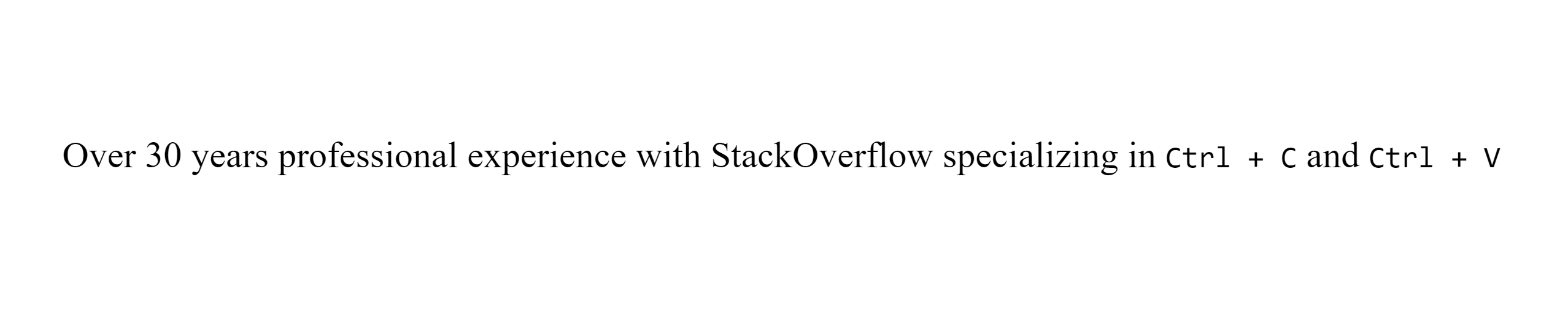
And speaking of StackOverflow, <kbd> has a nice styling there and other StackExchange sites.
10. cite
Indicates the title of a book, song, movie, or some other creative work:
One thing I love about <cite>Wednesday</cite> is how
Wednesday doesn't care about fitting in
Final thoughts
So these are 10 of the least known and utilized tags in HTML.
Quite useful in various situations despite their low usage.