Space is a fundamental element of visual design and is important in every user interface. When building web apps, we usually space out elements from one another by modifying their paddings and margins. Vuetify provides spacing helper classes for adjusting the padding and margin of elements without having to create new classes. We’re going to learn how to use them in this post.
All the Vuetify helper classes are of the following format: {property}{direction}-{size}.
property
The property specifies the type of spacing to apply to the element. There are two possible values:
m– applies a margin.p– applies padding.
direction
The direction indicates the margin or padding direction to apply the spacing. There are nine available directions in Vuetify:
t– applies the spacing for themargin-toporpadding-topCSS properties of the element.b– applies the spacing formargin-bottomorpadding-bottom.l– applies the spacing formargin-leftorpadding-left.r– applies the spacing formargin-rightorpadding-right.s– When Vuetify is in the default LTR mode,sacts similar tol. But in RTL mode, it behaves liker.e– When Vuetify is in the default LTR mode,eacts similar tor. But in RTL mode, it behaves likel.x– applies the spacing for both*-leftand*-right.y– applies the spacing for both*-topand*-bottom.a– applies the spacing for the property in all four directions.
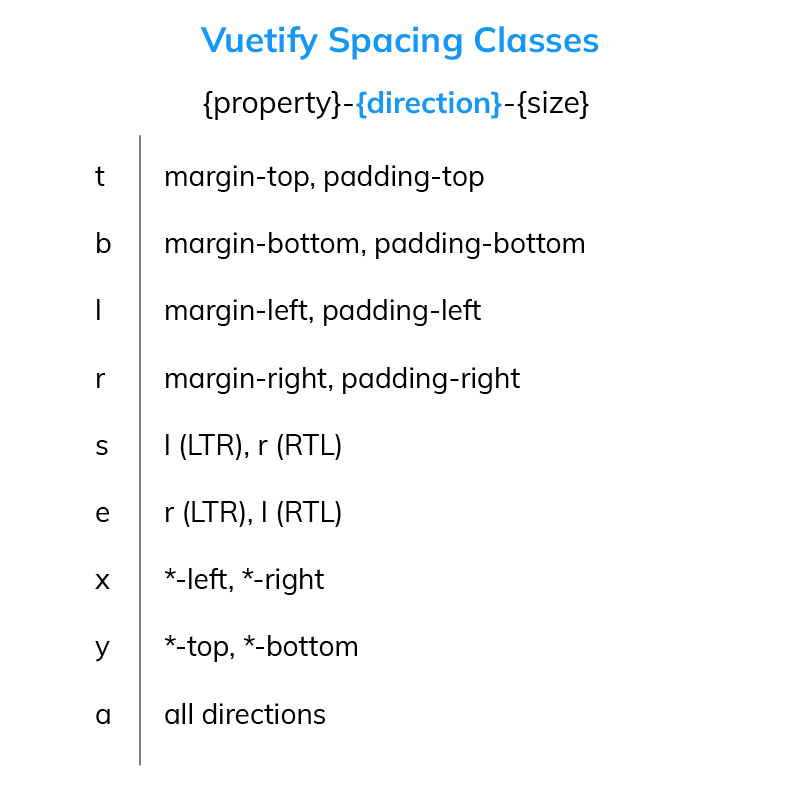
size
The size sets the actual value of the spacing in pixels. A size 0 will remove the margin or padding from the element in the specified direction. To get the number of pixels for positive values, simply multiply the size number by 4px. Vuetify provides 16 possible positive spacing values:
1– sets the margin or padding to4px.2– sets the margin or padding to8px.3– sets the margin or padding to12px.4– sets the margin or padding to16px.5– sets the margin or padding to20px.6– sets the margin or padding to24px.7– sets the margin or padding to28px.8– sets the margin or padding to32px.9– sets the margin or padding to36px.10– sets the margin or padding to40px.11– sets the margin or padding to44px.12– sets the margin or padding to48px.13– sets the margin or padding to52px.14– sets the margin or padding to56px.15– sets the margin or padding to60px.16– sets the margin or padding to64px.
We can specify negative spacing values by prefixing the number with an n. To get the number of pixels for negative values, multiply the size by -4px. Negative spacing values only apply to margins, and there are also 16 of them in Vuetify:
n1– sets the margin to-4px.n2– sets the margin to-8px.n3– set the margin to-12px.n4– sets the margin to-16px.n5– sets the margin to-20px.n6– sets the margin to-24px.n7– sets the margin to-28px.n8– sets the margin to-32px.n9– sets the margin to-36px.n10– sets the margin to-40px.n11– sets the margin to-44px.n12– sets the margin to-48px.n13– sets the margin to-52px.n14– sets the margin to-56px.n15– sets the margin to-60px.n16– sets the margin to-64px.
Apart from the above available spacing values, we also have the auto spacing, which sets margins or paddings of elements to the auto value.
Examples
Now that we know the Vuetify spacing helper classes, let’s see how to use them in practice.
<template>
<v-app>
<v-row>
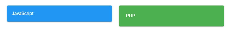
<v-col sm="6"> <v-card color="blue" dark>JavaScript</v-card> </v-col>
<v-col sm="6"> <v-card color="green" dark>PHP</v-card></v-col>
</v-row>
</v-app>
</template>
<script>
export default {
name: 'App',
};
</script>
Here we’ve created two cards and customized their colors:

Let’s add the mt-2 class to the v-row element containing the cards:
<template>
  <v-app>
    <v-row class="mt-2">
      <v-col sm="6"> <v-card color="blue" dark>JavaScript</v-card> </v-col>
      <v-col sm="6"> <v-card color="green" dark>PHP</v-card></v-col>
    </v-row>
  </v-app>
</template>

<script>
export default {
  name: 'App',
};
</script>
If you understood everything we covered previously, you’ll know that the mt-2 class will set the top margin of the v-row to 8px. When you run this code, you’ll see that there’s now some spacing between the two cards and the top of the page:

With the mx-3 class we’ll also create left and right margins (of 12px):
<template>
  <v-app>
    <v-row class="mt-2 mx-3">
      <v-col sm="6"> <v-card color="blue" dark>JavaScript</v-card> </v-col>
      <v-col sm="6"> <v-card color="green" dark>PHP</v-card></v-col>
    </v-row>
  </v-app>
</template>

<script>
export default {
  name: 'App',
};
</script>

And then, we’ll use the pa-4 and pa-6 classes to add paddings of different sizes to the two cards:
<template>
  <v-app>
    <v-row class="mt-2 mx-3">
      <v-col sm="6">
        <v-card color="blue" dark class="pa-4">JavaScript</v-card>
      </v-col>
      <v-col sm="6">
        <v-card color="green" dark class="pa-6">PHP</v-card></v-col
      >
    </v-row>
  </v-app>
</template>

<script>
export default {
  name: 'App',
};
</script>
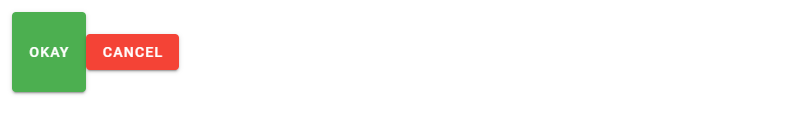
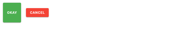
Here’s another example. We have two buttons, whose colors we’ve set to green and red:
<template>
  <v-app>
    <v-col>
      <v-btn color="green" dark>Okay</v-btn>
      <v-btn color="red" dark>Cancel</v-btn></v-col
    >
  </v-app>
</template>

<script>
export default {
  name: 'App',
};
</script>

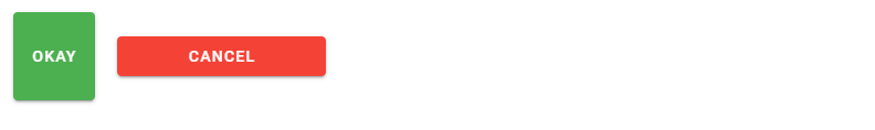
The py-10 class will add a bottom and top padding of 40px to the green button:
<template>
  <v-app>
    <v-col>
      <v-btn color="green" class="py-10" dark>Okay</v-btn>
      <v-btn color="red" dark>Cancel</v-btn></v-col
    >
  </v-app>
</template>

<script>
export default {
  name: 'App',
};
</script>
To space out the buttons, we’ll add a left margin to the Cancel button with the ml-5 class:
<template>
  <v-app>
    <v-col>
      <v-btn color="green" class="py-10" dark>Okay</v-btn>
      <v-btn color="red" dark class="ml-5">Cancel</v-btn></v-col
    >
  </v-app>
</template>

<script>
export default {
  name: 'App',
};
</script>
We’ll also pad it horizontally with the px-16 class:
<template>
  <v-app>
    <v-col>
      <v-btn color="green" class="py-10" dark>Okay</v-btn>
      <v-btn color="red" dark class="ml-5 px-16">Cancel</v-btn></v-col
    >
  </v-app>
</template>

<script>
export default {
  name: 'App',
};
</script>
Let’s add a negative right margin to the Okay button to remove the spacing we added:
<template>
  <v-app>
    <v-col>
      <v-btn color="green" class="py-10 mr-n5" dark>Okay</v-btn>
      <v-btn color="red" dark class="ml-5 px-16">Cancel</v-btn></v-col
    >
  </v-app>
</template>

<script>
export default {
  name: 'App',
};
</script>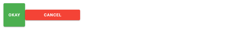
Conclusion
Vuetify provides spacing helper classes to allow us to space out and pad our UI elements without using custom classes or inline CSS. These classes can alter the margins or paddings of the elements in different directions and to various sizes.
11 Amazing New JavaScript Features in ES13
This guide will bring you up to speed with all the latest features added in ECMAScript 13. These powerful new features will modernize your JavaScript with shorter and more expressive code.

what if i want to apply margin-top :100px ?
Vuetify doesn’t have a predefined class that applies a margin of 100px, so you’ll need to use custom CSS, e.g.:
<div>First box</div><div style="margin-top:100px;">Second box</div>