New native nested CSS feature in 2024: An absolute game changer
The new native nested CSS feature changes everything for frontend development and makes SASS & LESS useless.
❌ Before:
How would you style the nested elements in this HTML?
<section>
  Hi!
  <div>
    <p><span>codingbeautydev.com</span> -- coding as a passion</p>
    Coding helps you achieve a sense of purpose and growth
  </div>
</section>
You’d normally stress yourself and waste a lot of time repeating the outer element names.
No wonder SASS and LESS became so popular.
section {
font-family: Arial;
}
section div {
font-size: 1.5em;
}
section div p {
color: blue;
}
section div p span {
font-weight: bold;
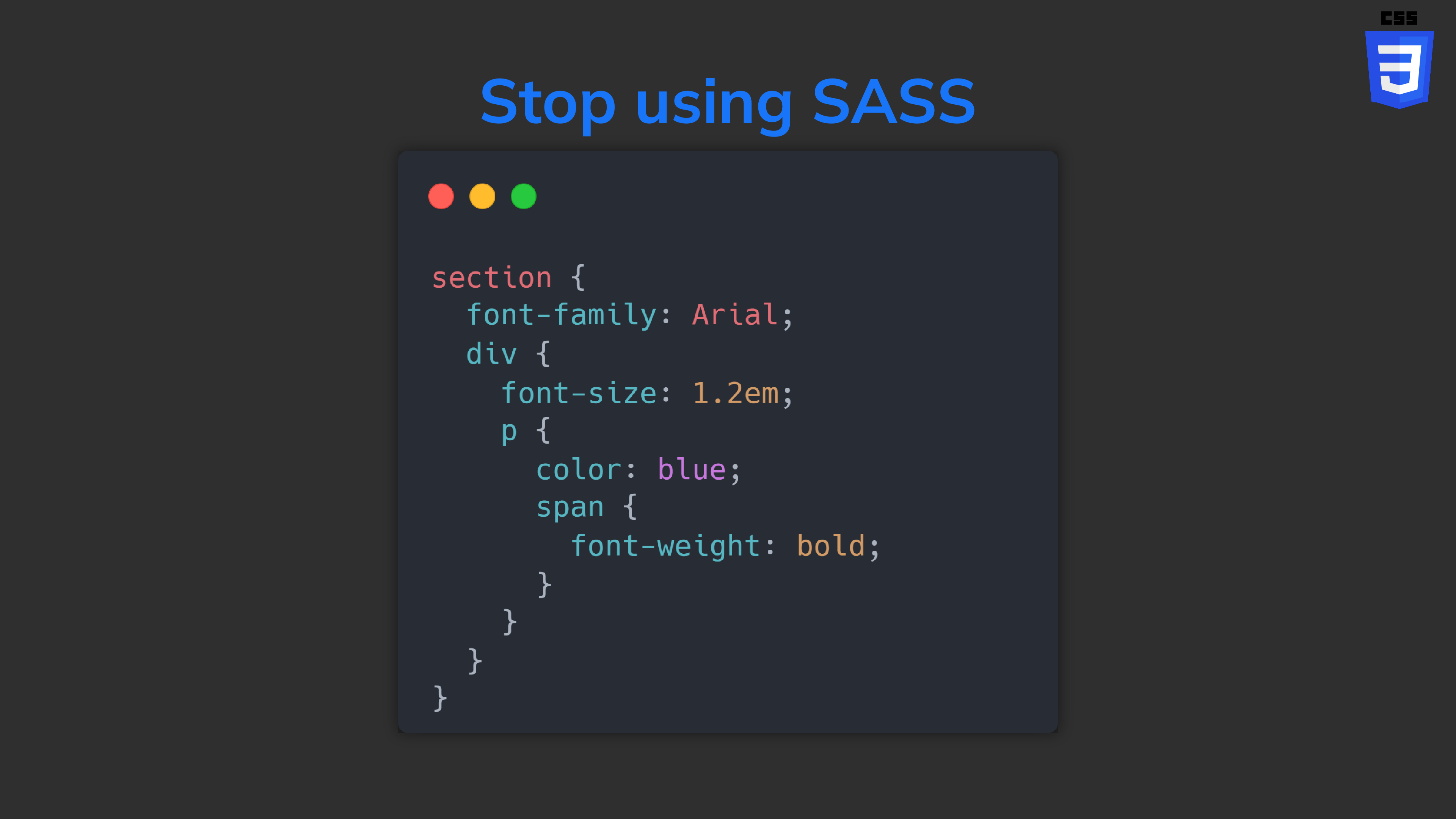
}✅ But now: with native CSS:
section {
  font-family: Arial;
  div {
    font-size: 1.2em;
    p {
      color: blue;
      span {
        font-weight: bold;
      }
    }
  }
}
So much cleaner and easier. All the styles are now encapsulated together instead of being scattered all over the place.
As intuitive as encapsulation in object-oriented programming:
// ❌ redundancy
const personName = 'Tari Ibaba';
const personSite = 'codingbeautydev.com';
const personColor = '🔵blue';

// ✅ encapsulate field
class Person {
  name = 'Tari Ibaba';
  site = 'codingbeautydev.com';
  color = '🔵blue';
}
In some browsers, you’ll need to use &:
section {
  font-family: Arial;
  & div {
    font-size: 1.2em;
    & p {
      color: blue;
      & span {
        font-weight: bold;
      }
    }
  }
}
What about classes and IDs?
What if you wanted to style nested elements by their class or id attribute?
<section class="class1">
  Hi!
  <div id="id1">
    <p class="class2">
      <span id="url">codingbeautydev.com</span> -- coding as a
      passion
    </p>
    Coding is cognitively challenging and mentally stimulating
  </div>
</section>
The nested CSS will be quite similar:
.class {
  font-family: Arial;
  #id1 {
    font-size: 1.2em;
    class2 {
      color: purple;
      #url {
        font-weight: bold;
      }
    }
  }
}
It also works with sibling selectors:
div {
  section {
    + p {
      color: blue;
      ~ p {
        color: red;
      }
    }
  }
}
Pseudo-classes and elements
Yes:
button {
  background-color: blue;
  :hover {
    background-color: yellow;
  }
}
Media queries
Another huge selling point of nested CSS:
❌ Before:
Creating media queries was messy and the query styles and main styles for an element were separated:
.hamburger {
  display: none;
}

.header {
  font-size: 40px;
}

@media (orientation: landscape) {
  .header {
  font-size: 32px;
}

@media (max-width: 480px) {
  .hamburger {
    display: block;
  }

  .header {
    font-size: 24px;
  }
}
✅ Now:
It makes more intuitive sense for the element styles to contain query styles — than for the query styles to contain small segments of the element styles.
Nested CSS lets you do this easily:
.hamburger {
  display: none;

  @media (max-width: 480px) {
    display: block;
  }
}

.header {
  font-size: 40px;

  @media(orientation: landscape) {
    font-size: 32px;
  }

  @media(max-width: 480px) {
    font-size: 24px;
  }
}
With native nested CSS you can create styles in a more intuitive manner.
SASS is practically useless now — especially now that we also have native variables in CSS:
$base-font-size: 16px;
$gutter-width: 10px;

.container {
  padding: calc($gutter-width * 2); // Use calc with Sass variable
  font-size: $base-font-size;
}

.heading {
  font-size: calc($base-font-size * 1.5); // Modify base font size with calc
}