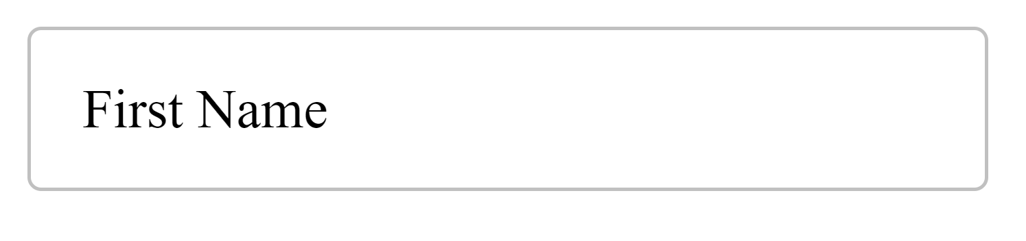
No doubt you’ve seen the beautiful text field if you’re one of Gmail’s 2 billion active users:
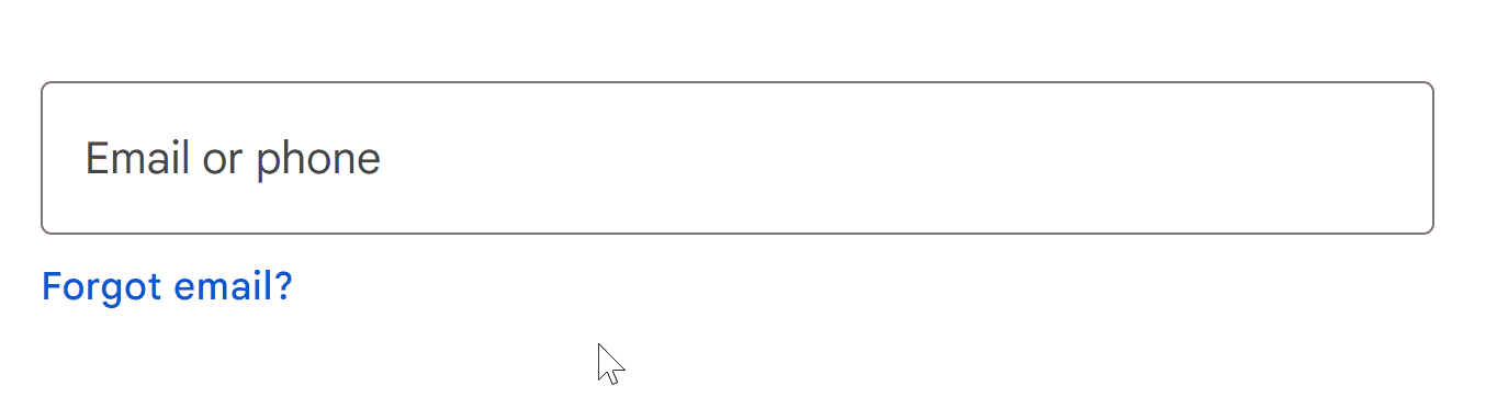
It’s fluid, it’s intuitive, it’s colorful 🎨.
It’s Material Design: the wildly popular UI design system powering YouTube, WhatsApp, and many other apps with billions of users.
Let’s embark on a journey of recreating it from scratch with pure vanilla HTML, CSS, and JavaScript.
1. Start: Create basic input and label
As always we start with the critical HTML foundation, the skeleton:
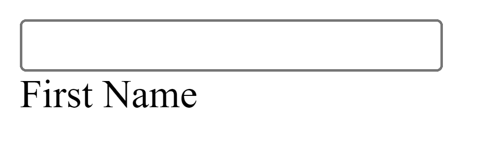
The text input, a label, and a wrapper for both:
<!-- For text animation -- soon -->
<div class="input-container">
  <input
    type="text"
    id="fname"
    name="fname"
    value=""
    aria-labelledby="label-fname"
  />

  <label class="label" for="fname" id="label-fname">
    <div class="text">First Name</div>
  </label>
</div>
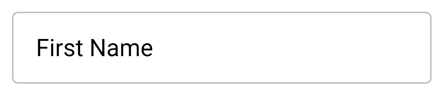
2. Style input and label
I find it pretty satisfying: using CSS to gradually flesh out a stunning UI on the backs of a solid HTML foundation.
Let’s start:
Firs the <input> and its container:
.input-container {
  position: relative; /* parent of .label */
}

input {
  height: 48px;
  width: 280px;
  border: 1px solid #c0c0c0;
  border-radius: 4px;
  box-sizing: border-box;
  padding: 16px;
}

.label {
  /* to stack on input */
  position: absolute;
  top: 0;
  bottom: 0;

  left: 16px; /* match input padding */

  /* center in .input-container */
  display: flex;
  align-items: center;
}

.label .text {
  position: absolute;
  width: max-content;
}
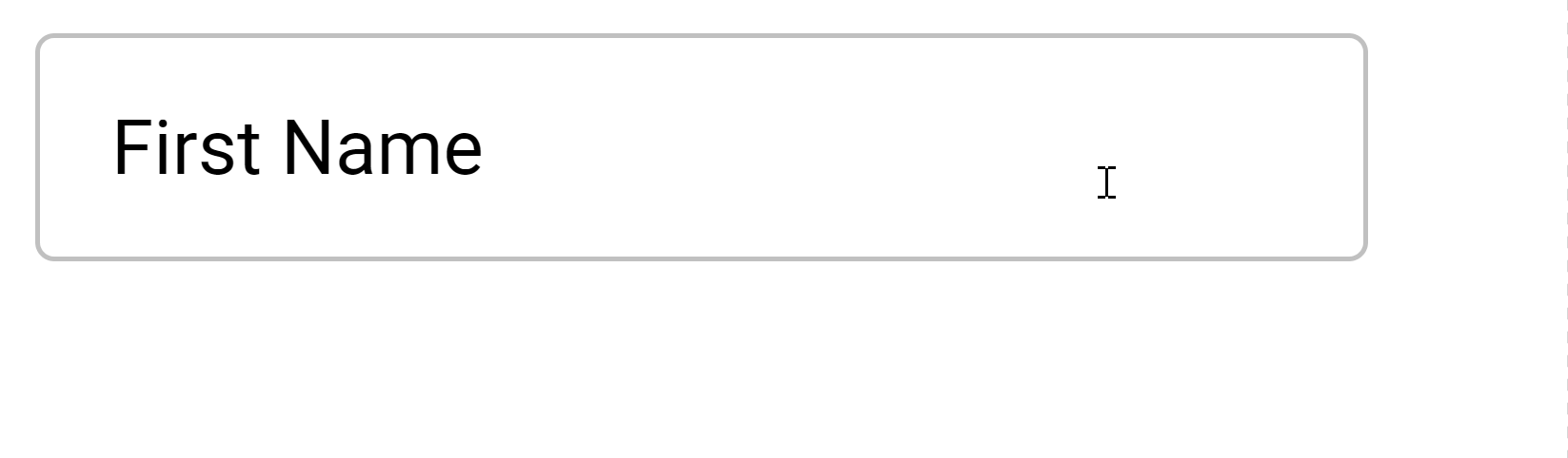
3. Remove pointer events
It resembles a text field now, but look what happens when I try focusing:
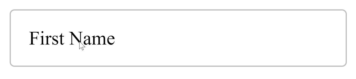
The label is part of the text field and the cursor should reflect that:
Solution? cursor: text
.label {
  ...
  cursor: text;

  /* Prevent blocking <input> focus */
  pointer-events: none;
}
4. Style input font
Now it’s time to customize font settings:
If you know Material Design well, you know Roboto is at the center of everything — much to the annoyance of some.
We’ll grab the embed code from Google Fonts:
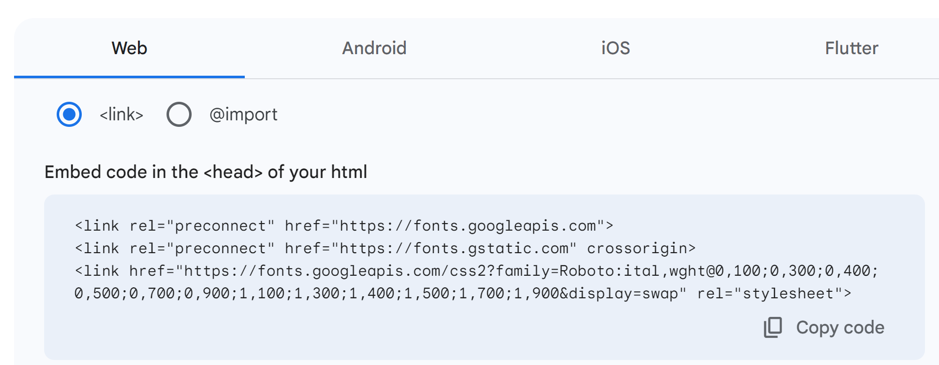
Embed:
Use:
input,
.label .text {
  font-family: 'Roboto';
  font-size: 16px;
}
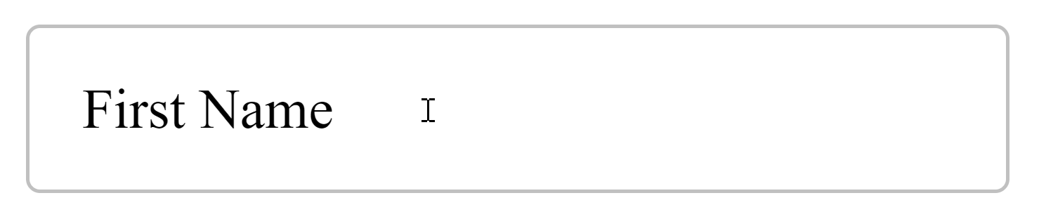
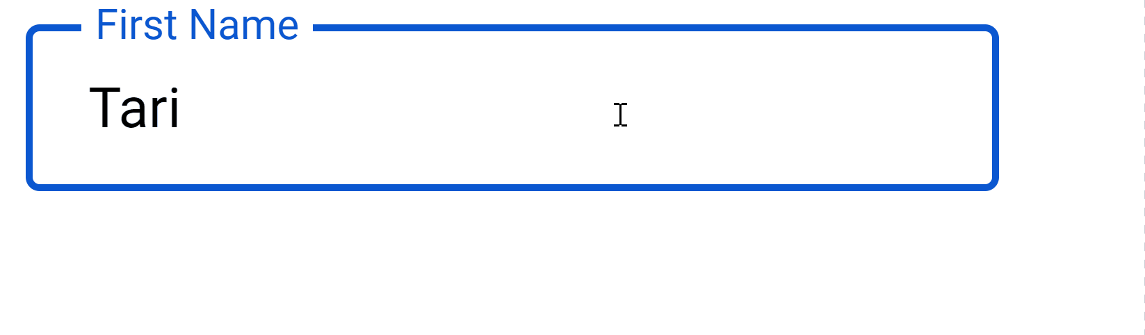
5. Style input on focus
You’ll do this with the :focus selector:
CSS
input:focus {
  outline: none;
  border: 2px solid blue;
}
✅
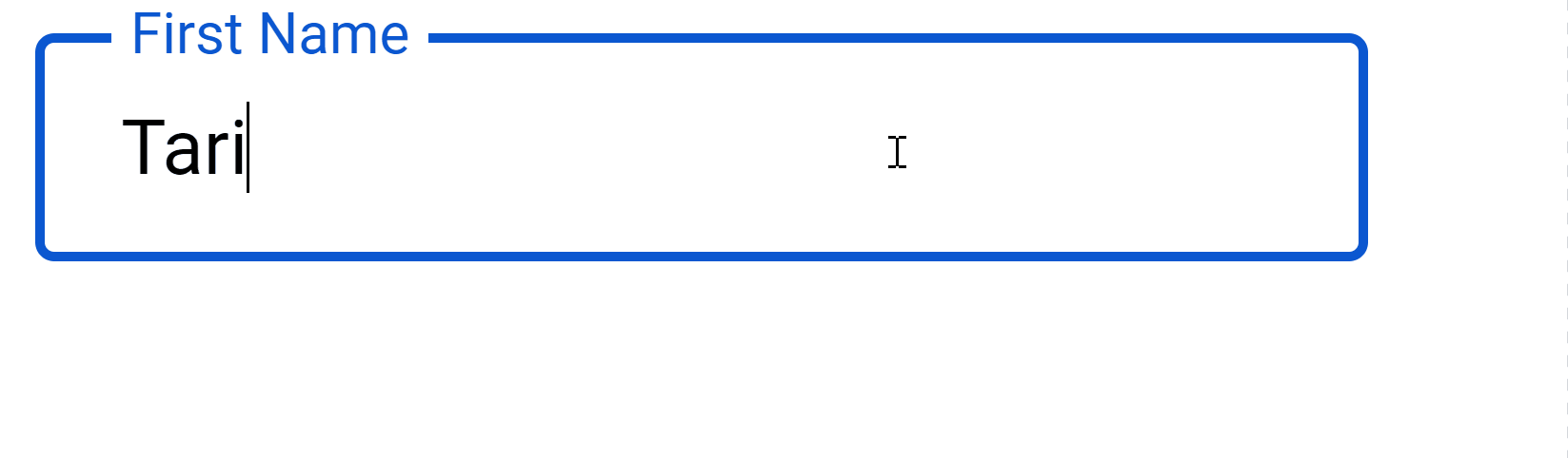
6. Fluidity magic: Style label on input focus
On focus the label does 3 things:
- Shrinks
- Move to top input border
- Match input border color
Of course we can do all these with CSS:
input:focus + .label .text {
  /* 1. Shrinks */
  font-size: 12px;

  /* 2. Move to top input border */
  transform: translate(0, -100%);
  top: 15%;

  padding-left: 4px;
  padding-right: 4px;

  /* 3. Match input border color */
  background-color: white;
  color: #0b57d0;
}
All we need to complete the fluidity is CSS transition:
label .text {
  transition: all 0.15s ease-out;
}
7. One more thing
Small issue: The label always goes to the original position after the input loses focus:
:focus which goes away on focus lost.But this should only happen when there’s no input yet.
CSS can’t fix this alone, we’re going to deploy the entire 3-tiered army of web dev.
HTML: input value to zero.
<input
  type="text"
  id="fname"
  name="fname"
  value=""
  aria-labelledby="label-fname"
/>
CSS: :not selector to give unfocused input label same position and size when not empty:
input:focus + .label .text,
/* ✅ no input yet */
:not(input[value='']) + .label .text {
  /* 1. Shrink */
  font-size: 12px;
  transform: translate(0, -100%);

  /* 2. Move to top */
  top: 15%;
  padding-left: 4px;
  padding-right: 4px;

  /* 3. Active color */
  background-color: white;
  color: #0b57d0;
}
And JavaScript: Sync initial input value attribute with user input
const input = document.getElementById('fname');

input.addEventListener('input', () => {
  input.setAttribute('value', input.value);
});
const input = document.getElementById('fname');

input.addEventListener('input', () => {
  input.setAttribute('value', input.value);
});
✅
That’s it! We’ve successfully created an outlined Material Design text field.
With React or Vue it’ll be pretty easy to abstract everything we’ve done into a reusable component.
Here’s the link to the full demo: CodePen
11 Amazing New JavaScript Features in ES13
This guide will bring you up to speed with all the latest features added in ECMAScript 13. These powerful new features will modernize your JavaScript with shorter and more expressive code.
