Every user interface contains some text. Different texts have different styles according to their purpose in the UI. Vuetify provides various classes that we can use to control various text properties such as size, alignment, wrapper, overflow and transforms. We’re going to learn about these typography helper classes in this article.
Font Size
Vuetify comes with classes for modifying the font size and style of a text. They are of the following formats:
.text-{value}for thexsbreakpoint..text-{breakpoint}-{value}for thesm,md,lgandxlbreakpoints.
The value can be any of the following:
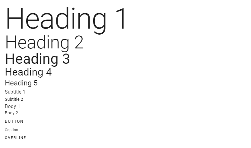
h1h2h3h4h5h6subtitle-1subtitle-2body-1body-2buttoncaptionoverline
<template>
  <v-app>
    <div class="ma-4">
      <div class="text-h1">Heading 1</div>
      <div class="text-h2">Heading 2</div>
      <div class="text-h3">Heading 3</div>
      <div class="text-h4">Heading 4</div>
      <div class="text-h5">Heading 5</div>
      <div class="text-subtitle-1">Subtitle 1</div>
      <div class="text-subtitle-2">Subtitle 2</div>
      <div class="text-body-1">Body 1</div>
      <div class="text-body-2">Body 2</div>
      <div class="text-button">Button</div>
      <div class="text-caption">Caption</div>
      <div class="text-overline">Overline</div>
    </div>
  </v-app>
</template>

<script>
export default {
  name: 'App',
};
</script>
Font Emphasis
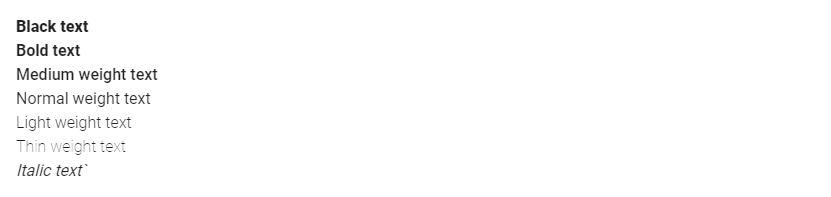
Vuetify also provides typography classes that control the font emphasis of the text. Material Design supports italicized text and font weights of 100, 300, 400, 500, 700 and 900.
<template>
  <v-app>
    <div class="ma-4">
      <div class="font-weight-black">Black text</div>
      <div class="font-weight-bold">Bold text</div>
      <div class="font-weight-medium">Medium weight text</div>
      <div class="font-weight-regular">Normal weight text</div>
      <div class="font-weight-light">Light weight text</div>
      <div class="font-weight-thin">Thin weight text</div>
      <div class="font-italic">Italic text</div>
    </div>
  </v-app>
</template>

<script>
export default {
  name: 'App',
};
</script>
Text Alignment
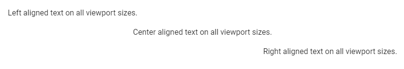
text-left, text-center, and text-right are typography classes used to set the alignment of text:
<template>
  <v-app>
    <div class="ma-4">
      <p class="text-left">Left aligned text on all viewport sizes.</p>
      <p class="text-center">Center aligned text on all viewport sizes.</p>
      <p class="text-right">Right aligned text on all viewport sizes.</p>
    </div>
  </v-app>
</template>

<script>
export default {
  name: 'App',
};
</script>
Just like with font weights, Vuetify also comes with typography classes for targeting certain viewport width ranges. They include:
text-sm-{value}text-md-{value}text-lg-{value}text-xl-{value}
value can be left, center or right.
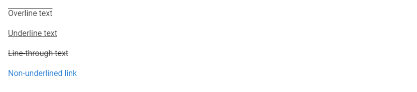
Text Decoration
In addition, Vuetify has typography classes for adding text decorations. There are of the form text-decoration-{value}, where value can be none, overline, underline or line-through.
<template>
  <v-app>
    <div class="ma-4">
      <p class="text-decoration-overline">Overline text</p>
      <p class="text-decoration-underline">Underline text</p>
      <p class="text-decoration-line-through">Line-through text</p>
      <a href="#" class="text-decoration-none">Non-underlined link</a>
    </div>
  </v-app>
</template>

<script>
export default {
  name: 'App',
};
</script>
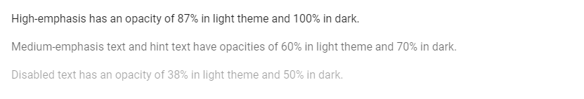
Text Opacity
Opacity typography helper classes are another handy way of adjusting text emphasis with Vuetify. text--primary has the same opacity as default text, text--secondary is used for hints and helper text. De-emphasize text with text--disabled.
<template>
  <v-app>
    <div class="ma-4">
      <p class="text--primary">
        High-emphasis has an opacity of 87% in light theme and 100% in dark.
      </p>
      <p class="text--secondary">
        Medium-emphasis text and hint text have opacities of 60% in light theme
        and 70% in dark.
      </p>
      <p class="text--disabled">
        Disabled text has an opacity of 38% in light theme and 50% in dark.
      </p>
    </div>
  </v-app>
</template>

<script>
export default {
  name: 'App',
};
</script>
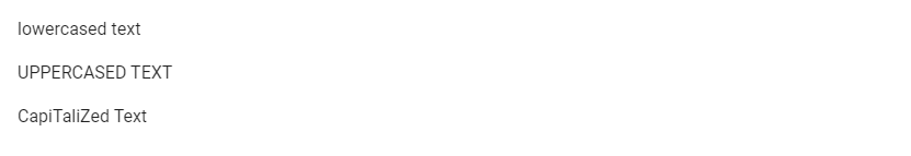
Text Transform
We can transform text with Vuetify using the text capitalization typography classes. They are text-lowercase, text-uppercase, and text-capitalize.
<template>
  <v-app>
    <div class="ma-4">
      <p class="text-lowercase">Lowercased text</p>
      <p class="text-uppercase">Uppercased text</p>
      <p class="text-capitalize">CapiTaliZed text</p>
    </div>
  </v-app>
</template>

<script>
export default {
  name: 'App',
};
</script>
Wrapping and Overflow
The text-no-wrap typography class allows us to prevent text wrapping:
<template>
  <v-app>
    <div class="text-no-wrap blue ma-4" style="width: 8rem">
      This text should overflow the parent.
    </div>
  </v-app>
</template>

<script>
export default {
  name: 'App',
};
</script>

Summary
Typography is an important aspect of every user interface. Vuetify provides various helper classes to allow us easily modify text properties.
11 Amazing New JavaScript Features in ES13
This guide will bring you up to speed with all the latest features added in ECMAScript 13. These powerful new features will modernize your JavaScript with shorter and more expressive code.
