Lists are used to display a group of related information. This information might be dynamic and modifiable by the user (e.g., a list of contacts or tasks) or it might be static (like a list of links for navigating around an app). Lists provide a consistent styling for a group of text or images. In this article, we’re going to learn how to add lists to our UI using the Vuetify list component.
The v-list Component
The names of the components for creating lists in Vuetify are quite self-explanatory. The v-list component is for creating lists. We use the v-list-item component to create an additional item in the list. v-list-item-content contains the primary list content, and v-list-item-title displays the list title. For example:
<template>
  <v-app>
    <v-card class="mx-auto ma-4">
      <v-list>
        <v-list-item
          v-for="i in 5"
          :key="i"
        >
          <v-list-item-content>
            <v-list-item-title>
              List Item {{ i }}
            </v-list-item-title>
          </v-list-item-content>
        </v-list-item>
      </v-list>
    </v-card>
  </v-app>
</template>

<script>
export default {
  name: 'App',
};
</script>

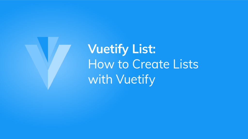
Vuetify List Two Line
Vuetify lists are single-line by default. To display two lines of content in a list, we set the two-line prop to true:
<template>
  <v-app>
    <v-card class="mx-auto ma-4">
      <v-list>
        <v-list-item
          v-for="i in 5"
          :key="i"
          two-line
        >
          <v-list-item-content>
            <v-list-item-title>
              List Item
            </v-list-item-title>
            <v-list-item-subtitle>
              Subtitle
            </v-list-item-subtitle>
          </v-list-item-content>
        </v-list-item>
      </v-list>
    </v-card>
  </v-app>
</template>

<script>
export default {
  name: 'App',
};
</script>
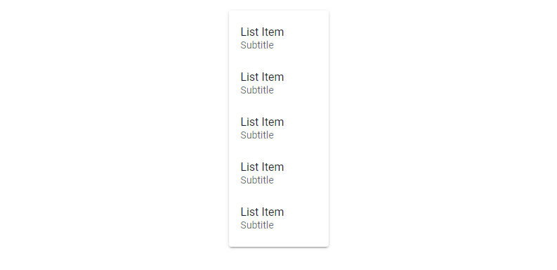
Vuetify List Three Line
We can also display three lines of text in a list with the three-line prop:
<template>
  <v-app>
    <v-card class="mx-auto ma-4">
      <v-list>
        <v-list-item
          v-for="i in 5"
          :key="i"
          three-line
        >
          <v-list-item-content>
            <v-list-item-title>
              List Item
            </v-list-item-title>
            <v-list-item-subtitle>
              Subtitle 1
            </v-list-item-subtitle>
            <v-list-item-subtitle>
              Subtitle 2
            </v-list-item-subtitle>
          </v-list-item-content>
        </v-list-item>
      </v-list>
    </v-card>
  </v-app>
</template>

<script>
export default {
  name: 'App',
};
</script>
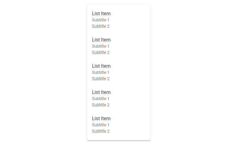
Vuetify List Item Groups
We can use the v-list-item-group component in a list to create a group of selectable list items.
<template>
  <v-app>
    <v-card class="mx-auto ma-4" width="300">
      <v-list>
        <v-list-item-group v-model="selectedItem" color="primary">
          <v-list-item v-for="(item, i) in items" :key="i">
            <v-list-item-icon
              ><v-icon v-text="item.icon"></v-icon
            ></v-list-item-icon>
            <v-list-item-content>
              <v-list-item-title v-text="item.text"></v-list-item-title>
            </v-list-item-content>
          </v-list-item>
        </v-list-item-group>
      </v-list>
    </v-card>
  </v-app>
</template>

<script>
export default {
  name: 'App',
  data: () => ({
    selectedItem: 1,
    items: [
      { text: 'Contacts', icon: 'mdi-account' },
      { text: 'Recent', icon: 'mdi-clock' },
      { text: 'Starred', icon: 'mdi-star' },
      { text: 'Settings', icon: 'mdi-cog' },
    ],
  }),
};
</script>
The list maintains state, and clicking another list item will change the selection:

Dense Lists
We can compact lists in Vuetify with the dense prop:
<template>
  <v-app>
    <v-card class="mx-auto ma-4" width="300">
      <v-list dense>
        <v-list-item-group v-model="selectedItem" color="primary">
          <v-list-item v-for="(item, i) in items" :key="i">
            <v-list-item-icon
              ><v-icon v-text="item.icon"></v-icon
            ></v-list-item-icon>
            <v-list-item-content>
              <v-list-item-title v-text="item.text"></v-list-item-title>
            </v-list-item-content>
          </v-list-item>
        </v-list-item-group>
      </v-list>
    </v-card>
  </v-app>
</template>

<script>
export default {
  name: 'App',
  data: () => ({
    selectedItem: 1,
    items: [
      { text: 'Contacts', icon: 'mdi-account' },
      { text: 'Recent', icon: 'mdi-clock' },
      { text: 'Starred', icon: 'mdi-star' },
      { text: 'Settings', icon: 'mdi-cog' },
    ],
  }),
};
</script>

Disabled Lists
We can disable interaction with a list by setting the disabled prop to true:
<template>
  <v-app>
    <v-card class="mx-auto ma-4" width="300">
      <v-list disabled>
        <v-list-item-group v-model="selectedItem" color="primary">
          <v-list-item v-for="(item, i) in items" :key="i">
            <v-list-item-icon
              ><v-icon v-text="item.icon"></v-icon
            ></v-list-item-icon>
            <v-list-item-content>
              <v-list-item-title v-text="item.text"></v-list-item-title>
            </v-list-item-content>
          </v-list-item>
        </v-list-item-group>
      </v-list>
    </v-card>
  </v-app>
</template>

<script>
export default {
  name: 'App',
  data: () => ({
    selectedItem: 1,
    items: [
      { text: 'Contacts', icon: 'mdi-account' },
      { text: 'Recent', icon: 'mdi-clock' },
      { text: 'Starred', icon: 'mdi-star' },
      { text: 'Settings', icon: 'mdi-cog' },
    ],
  }),
};
</script>
Flat Lists
The flat prop removes the background color of the selected list item:
<template>
  <v-app>
    <v-card class="mx-auto ma-4" width="300">
      <v-list flat>
        <v-list-item-group v-model="selectedItem" color="primary">
          <v-list-item v-for="(item, i) in items" :key="i">
            <v-list-item-icon
              ><v-icon v-text="item.icon"></v-icon
            ></v-list-item-icon>
            <v-list-item-content>
              <v-list-item-title v-text="item.text"></v-list-item-title>
            </v-list-item-content>
          </v-list-item>
        </v-list-item-group>
      </v-list>
    </v-card>
  </v-app>
</template>

<script>
export default {
  name: 'App',
  data: () => ({
    selectedItem: 1,
    items: [
      { text: 'Contacts', icon: 'mdi-account' },
      { text: 'Recent', icon: 'mdi-clock' },
      { text: 'Starred', icon: 'mdi-star' },
      { text: 'Settings', icon: 'mdi-cog' },
    ],
  }),
};
</script>

Vuetify List Nav Styling
Setting the nav prop to true on a v-list reduces the width and rounds the corners of the v-list-items in it:
<template>
  <v-app>
    <v-card class="mx-auto ma-4" width="300">
      <v-list nav>
        <v-list-item-group v-model="selectedItem" color="green">
          <v-list-item v-for="(item, i) in items" :key="i">
            <v-list-item-icon
              ><v-icon v-text="item.icon"></v-icon
            ></v-list-item-icon>
            <v-list-item-content>
              <v-list-item-title v-text="item.text"></v-list-item-title>
            </v-list-item-content>
          </v-list-item>
        </v-list-item-group>
      </v-list>
    </v-card>
  </v-app>
</template>

<script>
export default {
  name: 'App',
  data: () => ({
    selectedItem: 1,
    items: [
      { text: 'Contacts', icon: 'mdi-account' },
      { text: 'Recent', icon: 'mdi-clock' },
      { text: 'Starred', icon: 'mdi-star' },
      { text: 'Settings', icon: 'mdi-cog' },
    ],
  }),
};
</script>
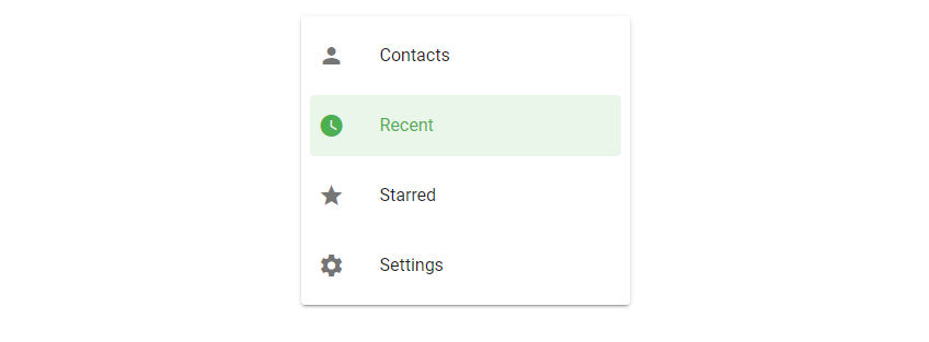
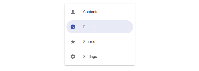
Rounded List Items in Vuetify
We can make the v-list-items inside a v-list fully rounded by setting the rounded prop to true:
<template>
  <v-app>
    <v-card class="mx-auto ma-4" width="300">
      <v-list rounded>
        <v-list-item-group v-model="selectedItem" color="indigo">
          <v-list-item v-for="(item, i) in items" :key="i">
            <v-list-item-icon
              ><v-icon v-text="item.icon"></v-icon
            ></v-list-item-icon>
            <v-list-item-content>
              <v-list-item-title v-text="item.text"></v-list-item-title>
            </v-list-item-content>
          </v-list-item>
        </v-list-item-group>
      </v-list>
    </v-card>
  </v-app>
</template>

<script>
export default {
  name: 'App',
  data: () => ({
    selectedItem: 1,
    items: [
      { text: 'Contacts', icon: 'mdi-account' },
      { text: 'Recent', icon: 'mdi-clock' },
      { text: 'Starred', icon: 'mdi-star' },
      { text: 'Settings', icon: 'mdi-cog' },
    ],
  }),
};
</script>
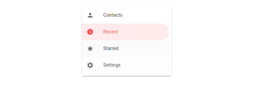
Shaped List Items in Vuetify
Lists with the shaped prop set to true have rounded borders on one side of the v-list-items:
<template>
  <v-app>
    <v-card class="mx-auto ma-4" width="300">
      <v-list shaped>
        <v-list-item-group v-model="selectedItem" color="red accent-2">
          <v-list-item v-for="(item, i) in items" :key="i">
            <v-list-item-icon
              ><v-icon v-text="item.icon"></v-icon
            ></v-list-item-icon>
            <v-list-item-content>
              <v-list-item-title v-text="item.text"></v-list-item-title>
            </v-list-item-content>
          </v-list-item>
        </v-list-item-group>
      </v-list>
    </v-card>
  </v-app>
</template>

<script>
export default {
  name: 'App',
  data: () => ({
    selectedItem: 1,
    items: [
      { text: 'Contacts', icon: 'mdi-account' },
      { text: 'Recent', icon: 'mdi-clock' },
      { text: 'Starred', icon: 'mdi-star' },
      { text: 'Settings', icon: 'mdi-cog' },
    ],
  }),
};
</script>
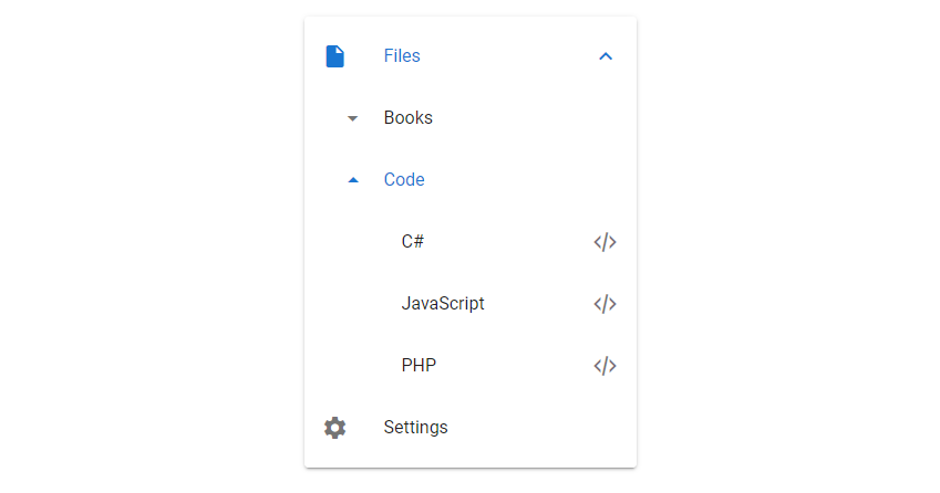
Vuetify List Sub Groups
With the v-list-group component and its sub-group prop we can create sub groups of up to two levels in depth:
<template>
  <v-app>
    <v-card class="mx-auto ma-4" width="300">
      <v-list>
        <v-list-group :value="true" prepend-icon="mdi-file">
          <template v-slot:activator>
            <v-list-item-title>Files</v-list-item-title>
          </template>
          <v-list-group :value="true" no-action sub-group>
            <template v-slot:activator>
              <v-list-item-content>Books</v-list-item-content>
            </template>

            <v-list-item v-for="(book, i) in books" :key="i" link>
              <v-list-item-title v-text="book"></v-list-item-title>
              <v-list-item-icon><v-icon>mdi-book</v-icon></v-list-item-icon>
            </v-list-item>
          </v-list-group>
          <v-list-group no-action sub-group>
            <template v-slot:activator>
              <v-list-item-content>Code</v-list-item-content>
            </template>

            <v-list-item v-for="(code, i) in codes" :key="i" link>
              <v-list-item-title v-text="code"></v-list-item-title>
              <v-list-item-icon><v-icon>mdi-xml</v-icon></v-list-item-icon>
            </v-list-item>
          </v-list-group>
        </v-list-group>
        <v-list-item>
          <v-list-item-icon><v-icon>mdi-cog</v-icon></v-list-item-icon>
          <v-list-item-title>Settings</v-list-item-title>
        </v-list-item>
      </v-list>
    </v-card>
  </v-app>
</template>

<script>
export default {
  name: 'App',
  data: () => ({
    selectedItem: 1,
    books: ['History', 'Fiction', 'Philosophy'],
    codes: ['C#', 'JavaScript', 'PHP'],
  }),
};
</script>
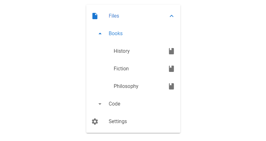
We can expand and contract the sub groups as needed:
Summary
Lists are used to present a group of information that are related in some way. Vuetify provides v-list, v-list-group, v-list-item and other components for creating and customizing lists.
Every Crazy Thing JavaScript Does
A captivating guide to the subtle caveats and lesser-known parts of JavaScript.
