Text fields are the most common way of accepting text input in a UI. They can collect user information like emails, addresses, phone numbers, etc. Let’s see how we can use them in Vuetify.
The v-text-field Component
We create text fields in Vuetify with the v-text-field component:
<template>
  <v-app>
    <v-row justify="center" class="ma-2">
      <v-col cols="4"><v-text-field label="Regular"></v-text-field></v-col>
    </v-row>
  </v-app>
</template>

<script>
export default {
  name: 'App',
};
</script>


Vuetify Text Field Placeholders
We can indicate an expected value for the text field with the placeholder prop:
<template>
  <v-app>
    <v-row justify="center" class="ma-2">
      <v-col cols="4"
        ><v-text-field label="Regular" placeholder="Placeholder"></v-text-field
      ></v-col>
    </v-row>
  </v-app>
</template>

<script>
export default {
  name: 'App',
};
</script>
Customizing Text Field Colors in Vuetify
We can customize the color of text fields by setting the color prop to a color in the Material Design palette:
<template>
  <v-app>
    <v-row justify="center" class="ma-2">
      <v-col cols="4"
        ><v-text-field
          label="Username"
          color="green"
        ></v-text-field
      ></v-col>
    </v-row>
  </v-app>
</template>

<script>
export default {
  name: 'App',
};
</script>

Vuetify Text Field Filled Variant
We can use the filled variant of the text field with the filled prop:
<template>
  <v-app>
    <v-row justify="center" class="ma-2">
      <v-col cols="4"
        ><v-text-field label="Filled" filled></v-text-field
      ></v-col>
    </v-row>
  </v-app>
</template>

<script>
export default {
  name: 'App',
};
</script>

Vuetify Text Field Outlined Variant
Setting the outlined prop to true on the text field component will use its outlined variant:
<template>
  <v-app>
    <v-row justify="center" class="ma-2">
      <v-col cols="4"
        ><v-text-field label="Outlined" outlined></v-text-field
      ></v-col>
    </v-row>
  </v-app>
</template>

<script>
export default {
  name: 'App',
};
</script>

Vuetify Shaped Text Fields
Text fields with the shaped prop have an increased border radius for the top two corners:
<template>
  <v-app>
    <v-row class="ma-2">
      <v-col cols="6"
        ><v-text-field label="First Name" filled shaped></v-text-field
      ></v-col>
      <v-col cols="6"
        ><v-text-field label="Last Name" outlined shaped></v-text-field
      ></v-col>
    </v-row>
  </v-app>
</template>

<script>
export default {
  name: 'App',
};
</script>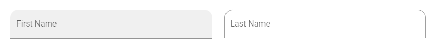
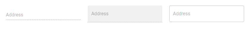
Disabling Text Fields in Vuetify
We can stop a text field from accepting any input by setting the disabled prop to true.
<template>
  <v-app>
    <v-row class="ma-2">
      <v-col cols="4"
        ><v-text-field label="Address" disabled></v-text-field
      ></v-col>
      <v-col cols="4"
        ><v-text-field label="Address" filled disabled></v-text-field
      ></v-col>
      <v-col cols="4"
        ><v-text-field label="Address" outlined disabled></v-text-field
      ></v-col>
    </v-row>
  </v-app>
</template>

<script>
export default {
  name: 'App',
};
</script>
Readonly Text Fields
We can also prevent text field input with the readonly prop:
<template>
  <v-app>
    <v-row class="ma-2" justify="center">
      <v-col cols="4"
        ><v-text-field label="Regular" value="Regular" readonly></v-text-field
      ></v-col>
    </v-row>
  </v-app>
</template>

<script>
export default {
  name: 'App',
};
</script>
Solo Text Fields
We can style text fields with an alternative solo design with the solo prop:
<template>
  <v-app>
    <v-row class="ma-2" justify="center">
      <v-col cols="4"
        ><v-text-field
          label="Solo"
          solo
        ></v-text-field
      ></v-col>
    </v-row>
  </v-app>
</template>

<script>
export default {
  name: 'App',
};
</script>


Single-line Text Fields
To prevent text field labels from floating when focused, we can use the single-line prop:
<template>
  <v-app>
    <v-row class="ma-2" justify="center">
      <v-col cols="4"
        ><v-text-field label="Single-line" single-line></v-text-field
      ></v-col>
    </v-row>
  </v-app>
</template>

<script>
export default {
  name: 'App',
};
</script>


Summary
Vuetify provides the v-text-field component for creating text fields, which are useful for getting text input from users.
Every Crazy Thing JavaScript Does
A captivating guide to the subtle caveats and lesser-known parts of JavaScript.
