Tooltips are useful for passing on information when a user hovers over an element in an interface. When a tooltip is activated, it displays a text label that identifies its associated element, for example, describing its function. Read on to find out more about the Vuetify tooltip component and the different customization options provided.
The v-tooltip Component
Vuetify provides the v-tooltip component for creating a tooltip. v-tooltip can wrap any element.
<template>
  <v-app>
    <div class="text-center d-flex ma-4 justify-center">
      <v-tooltip bottom>
        <template v-slot:activator="{ on, attrs }">
          <v-btn color="primary" dark v-bind="attrs" v-on="on"> Button </v-btn>
        </template>
        <span>Tooltip</span>
      </v-tooltip>
    </div>
  </v-app>
</template>

<script>
export default {
  name: 'App',
};
</script>

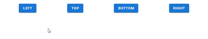
Vuetify Tooltip Alignment
We can use one of the position props (top, bottom, left, or right) of the v-tooltip component to set the tooltip alignment. Note that it is required to set one of these props.
<template>
  <v-app>
    <div class="d-flex ma-4 justify-space-around">
      <v-tooltip left>
        <template v-slot:activator="{ on, attrs }">
          <v-btn color="primary" dark v-bind="attrs" v-on="on"> Left </v-btn>
        </template>
        <span>Left tooltip</span>
      </v-tooltip>

      <v-tooltip top>
        <template v-slot:activator="{ on, attrs }">
          <v-btn color="primary" dark v-bind="attrs" v-on="on"> Top </v-btn>
        </template>
        <span>Top tooltip</span>
      </v-tooltip>

      <v-tooltip bottom>
        <template v-slot:activator="{ on, attrs }">
          <v-btn color="primary" dark v-bind="attrs" v-on="on"> Bottom </v-btn>
        </template>
        <span>Bottom tooltip</span>
      </v-tooltip>

      <v-tooltip right>
        <template v-slot:activator="{ on, attrs }">
          <v-btn color="primary" dark v-bind="attrs" v-on="on"> Right </v-btn>
        </template>
        <span>Right tooltip</span>
      </v-tooltip>
    </div>
  </v-app>
</template>

<script>
export default {
  name: 'App',
};
</script>
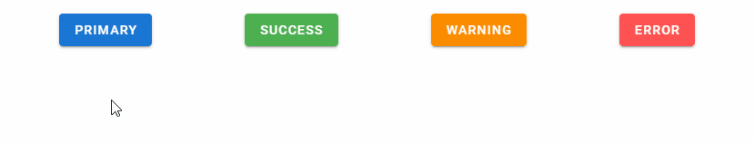
Vuetify Tooltip Colors
Like many other components in Vuetify, the v-tooltip component comes with the color prop for customizing the color of the tooltip.
<template>
  <v-app>
    <div class="d-flex ma-4 justify-space-around">
      <v-tooltip bottom color="primary">
        <template v-slot:activator="{ on, attrs }">
          <v-btn color="primary" dark v-bind="attrs" v-on="on"> primary </v-btn>
        </template>
        <span>Primary tooltip</span>
      </v-tooltip>

      <v-tooltip bottom color="success">
        <template v-slot:activator="{ on, attrs }">
          <v-btn color="success" dark v-bind="attrs" v-on="on"> success </v-btn>
        </template>
        <span>Success tooltip</span>
      </v-tooltip>

      <v-tooltip bottom color="warning">
        <template v-slot:activator="{ on, attrs }">
          <v-btn color="warning" dark v-bind="attrs" v-on="on"> warning </v-btn>
        </template>
        <span>Warning tooltip</span>
      </v-tooltip>

      <v-tooltip bottom color="error">
        <template v-slot:activator="{ on, attrs }">
          <v-btn color="error" dark v-bind="attrs" v-on="on"> error </v-btn>
        </template>
        <span>Error tooltip</span>
      </v-tooltip>
    </div>
  </v-app>
</template>

<script>
export default {
  name: 'App',
};
</script>
Vuetify Tooltip Visibility
Using v-model on a v-tooltip allows us to set up a two-way binding between the visibility of the tooltip and a variable. For example, in the code below, we’ve created a button and a tooltip below it. Clicking the button will negate the show variable and toggle the visibility of the tooltip.
<template>
  <v-app>
    <v-container fluid class="text-center ma-4">
      <v-row class="flex" justify="space-between">
        <v-col cols="12">
          <v-btn @click="show = !show" color="purple accent-4" dark>
            toggle
          </v-btn>
        </v-col>

        <v-col cols="12" class="mt-12">
          <v-tooltip v-model="show" top>
            <template v-slot:activator="{ on, attrs }">
              <v-btn icon v-bind="attrs" v-on="on">
                <v-icon color="grey lighten-1"> mdi-alarm </v-icon>
              </v-btn>
            </template>
            <span>Programmatic tooltip</span>
          </v-tooltip>
        </v-col>
      </v-row>
    </v-container>
  </v-app>
</template>

<script>
export default {
  name: 'App',
  data: () => ({
    show: false,
  }),
};
</script>

Conclusion
A tooltip is useful for conveying information when the user hovers over an element. Use the Vuetify tooltip component (v-tooltip) and its various props to create and customize tooltips.
11 Amazing New JavaScript Features in ES13
This guide will bring you up to speed with all the latest features added in ECMAScript 13. These powerful new features will modernize your JavaScript with shorter and more expressive code.
