
To change an element’s style on hover in React, set a className on the element, and style its :hover pseudo-class.
For example:
import './App.css';

export default function App() {
  return (
    <div>
      <div className="box">
        <p>Coding Beauty</p>
      </div>
    </div>
  );
}
.box {
  height: 100px;
  width: 100px;
  background-color: blue;
  color: white;
  font-weight: bold;
  padding: 8px;
  text-align: center;
}

.box:hover {
  background-color: yellow;
  color: black;
}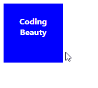
We use the :hover pseudo-class to style an element when the user hovers over it with the mouse pointer.
Change element style on hover with inline styling
We can also change an element’s style on hover using inline styles and the element’s style prop. To do this, we need to create state that will determine whether the hover styles should be applied to the element or not. We also need to add event listeners for the mouseenter and mouseleave and change the state’s value in them.
For example:
import { useState } from 'react';

export default function App() {
  const [hover, setHover] = useState(false);

  const handleMouseEnter = () => {
    setHover(true);
  };

  const handleMouseLeave = () => {
    setHover(false);
  };

  return (
    <div>
      <div
        style={{
          height: '100px',
          width: '100px',
          backgroundColor: hover ? 'yellow' : 'blue',
          color: hover ? 'black' : 'white',
          fontWeight: 'bold',
          padding: '8px',
          textAlign: 'center',
        }}
        onMouseEnter={handleMouseEnter}
        onMouseLeave={handleMouseLeave}
      >
        <p>Coding Beauty</p>
      </div>
    </div>
  );
}
We use the useState hook to create the boolean state variable that will determine whether the hover styles should be applied to the element or not. useState returns an array of two values. The first is a variable that stores the state, and the second is a function that updates the state when it is called.
We use the onMouseEnter prop to listen for the mouseenter event to detect when the mouse enters within the element’s bounds.
Note: While we could also listen for the mouseover event to detect hover, this event is triggered on an element and every single one of its ancestor elements in the DOM tree (i.e. it bubbles) and this could cause serious performance problems in deep hierarchies. mouseenter doesn’t bubble so we can use it without worrying about this.
Similarly, we use the onMouseLeave prop to listen for the mouseleave to detect when the mouse leaves the element’s bounds.
We use the ternary operator to conditionally set the style based on the boolean state.
Change element style on hover with custom component
If you frequently use the inline styles approach to change the element’s style on hover, it will be better if you encapsulate the logic into a custom component, so you can reuse it in multiple places in your codebase and avoid unnecessary duplication.
Here’s what such a component would like:
import { useState } from 'react';

export default function Hover({ children }) {
  const [hover, setHover] = useState();

  const handleMouseEnter = () => {
    setHover(true);
  };

  const handleMouseLeave = () => {
    setHover(false);
  };

  return (
    <div
      style={{ display: 'contents' }}
      onMouseEnter={handleMouseEnter}
      onMouseLeave={handleMouseLeave}
    >
      {children(hover)}
    </div>
  );
}
The Hover component takes a callback function as its child. It passes the state variable storing the hover state to this callback so that you can use it to change the style of the element returned from the callback. Hover calls the callback to render this element.
It wraps the element with a div, on which it listens for the mouseenter and mouseleave events to update the state variable. We set the display CSS property to contents on the wrapper because it plays no visual role on the page. It’s only there for the hover detection.
Here’s how we can use our custom Hover component.
import Hover from './Hover';

export default function App() {
  return (
    <div>
      <Hover>
        {(hover) => (
          <div
            style={{
              height: '100px',
              width: '100px',
              backgroundColor: hover ? 'yellow' : 'blue',
              color: hover ? 'black' : 'white',
              fontWeight: 'bold',
              padding: '8px',
              textAlign: 'center',
            }}
          >
            <p>Coding Beauty</p>
          </div>
        )}
      </Hover>
    </div>
  );
}
Every Crazy Thing JavaScript Does
A captivating guide to the subtle caveats and lesser-known parts of JavaScript.
